Pages

Thursday, 28 January 2016

White Anniversary


Hi everyone, thank you for stopping by today.

Recently, I was asked to come up with a few anniversary cards and I wanted to share this one with you today. I wanted to put together a card that was very delicate and for this I love the white on white.


As this is a one layer card, I had to get creative in order to have the embossed area in the centre area. I lined the embossing folder with the edges of my plates so that there was only pressure in the one area. Then I ran the plates through the machine so that it would only emboss a small area. Because of the hard edge where the plates ended, I added the ribbon to hide the harsh line.

I die cut a small heart and very lightly traced around it. Then I erased the pencil marks so I could just barely seem them, and added the small red gems.

I added a few clear shimmer sequins (probably from Michael's) to add just a bit of shine.

I hope you all like the card for today and are inspired to create something of your own.


I'd like to submit this card to the Simon Says Stamp Wednesday Challenge: Anything Goes.

Valentine's Day 2016 Series - Card 9


Hi everyone, thank you for stopping by, I hope you are having a great day.

For today's card, I wanted to step away from the way I usually make my cards. Since I got into stamping and colouring I generally use them on everything I do. Why wouldn't I? It really is the best way to practice; and the more you practice something the better you get.

But sometimes it's really nice to step away from your current comfort zone and do something you have done in a while. So when I saw Jenni's card over at the Muse Challenge, I knew exactly what I wanted to do. I had been looking for an opportunity to use this stamp and up until now, I didn't have one.

So thank you Jenni, for inspiring me!


For this card, I began by heat embossing the Definition of Love stamp in black. I then trimmed the panel and matted with a deep red cardstock.

For the bottom white panel I used a swirly stamp with clear heat embossing and used a light pink distress ink for a resist technique. I also matted that with the same red cardstock.

The flower is die cut from the same red as well, I die cut two extra blossoms and stacked the petals for more dimension. I used micro pearls for a cluster in the centre.

I finished this card off with three small pearls just to add a bit of shine (since there really was nowhere to put any glitter).


I'd like to submit this card to the following challenges:

1. Simon Says Stamp Monday Challenge - Love is in the Air, (using red)

2. Muse Challenge 150 - where Jenni's beautiful card is the muse of the week

3. Simon Says Stamp Monday Challenge - Anything Goes

I hope you all liked my card for today and are inspired to create something of your own.


Don't forget to follow this blog by using the blue button in the right sidebar. 

Saturday, 23 January 2016

Little Somethin' for the Boys


Hi everyone, thank you for stopping by. I hope you are having a great day!

Today I wanted to share two cards that I was asked to make by a friend for two little guys that are very special to her.

Over the past couple weeks I have done several masculine cards and I wanted to share a couple cards that are made for younger boys. While most kids won't understand or appreciate the work that goes into making a handmade card; their parents will, and it is always wonderful to have something completely unique to keep as a memento or to put in their keepsake box. (All Moms have one. Or two. Maybe three.)


This first card was created with an MFT stamp and coloured with copics. I used Lawn Fawn's stitched clouds with vellum over top of a tiny stars patterned paper, to make it look as though he were flying through the night sky. I heat embossed the greeting with fine detail black embossing powder.


This second card was created with Lawn Fawn Critters from the Past stamp set and coloured with copic markers. I don't have the die cuts for this set, so I fussy cut them out. I used the stitched hillside boarder die and the stitched cloud die as well to create the scene. The greeting is stamped with Lawn Fawn's Black Licorice ink. The dinosaur is raised on foam squares to give a little extra dimension.

I hope you all like these cards and are inspired to create something of your own.

Don't forget to follow this blog by clicking the blue button over on the right side bar.

Friday, 22 January 2016

Birthday Critters

Hi everyone, thank you so much for stopping by, I hope you are all having a great day!

It doesn't really matter what time of year it is, there is always a need for birthday cards. I wanted to create a card that could be suitable for almost anyone!


The critters are coloured with copics on 110lb cardstock, I stamped them with memento tuxedo black ink, then masked them off. I then masked off the top and the bottom of the card so I could sponge on the background strip. After colouring the critters I used wink of stella clear on the balloons and the party hats and then used glossy accents on the balloons and the little beaks.

I just love the way the glossy accents really makes the shimmer come through. By far one of my favourite things to do!


This card is for the following challenges:


Hope you all like this card, and that it inspires you to create your own.

Don't forget to follow this blog using the blue button on the right sidebar!


Masculine Watercolour in Browns


Hi everyone, thank you so much for stopping by, I hope you are all having a great day.

Generally when I think of watercolour, I think of soft edges with delicate colours. But that doesn't always have to be the case.

Today's card is a masculine watercolour using only browns. I've said before that I find it very difficult to create masculine cards, and I find the best way to overcome difficulty is to practice, practice and practice.


I created the panel by applying a generous, even layer of clean water on 140lb watercolour paper. Then I dropped in my first (lightest) layer of brown, and allowed that to mostly dry. When the paper was a bit more than damp, but not really wet, I added the next shade of brown. Because the paper wasn't as wet, when the colour spreads you get harder lines and less of the ethereal look that I typically have in my watercolour backgrounds. I repeated the process with the darkest shade.

Once the panel was completely dry, I used the water droplet technique to wick away some of the colour randomly. Then I hit it with my heat gun to make sure it was very dry.

For the image, I inked up my stamp using Lawn Fawn's Walnut ink and stamped it once in the corner. I used the same ink for the greeting, but stamped it twice in place to make it very dark.

Hope you all like this card, and are inspired to create your own.

Don't forget to follow me by clicking the little blue button on the right sidebar.

Thursday, 21 January 2016

Valentine's Day 2016 Series - Card 8


Hi everyone, thank you for stopping by today!

Today I have another card for my 2016 Valentine's Day Series. 

This card was created with distress ink watercolouring on 140lb watercolour paper. To begin, I wet the background panel generously with clean water and then dropped in worn lipstick and picked raspberry.

The raised circle was created the same way after I clear embossed the swirly love stamp. This was then put onto a scalloped circle and raised with foam tape.

While I could have been done at that point, I thought the card needed just a little bit more, so I added three strips of ribbon to add interest.


Distress ink watercolour on 140lb cold press watercolour paper.

Monday, 18 January 2016

Forever Friends


Hi everyone, thanks so much for stopping by today. It's wonderful to have you here.

Today's card is for the Simon Says Stamp Monday Challenge: Best Friends. As they said, there are so many ways to interpret this theme, and I had originally thought of pets. The whole "Man's best friend" and all, but then I thought with Valentine's Day right around the corner a more romantic card would be just as fitting. More of a "Today I married my best friend" theme.

I hope you all like this card, and I truly hope that this card inspires you to create something of your own.


For this card, I first cut a landscape boarder for the grass and masked off the upper portion of the panel. I applied the distress ink very generously until the hillside looked the way I wanted it to. 

I then used the other side of the scrap I had cut to mask off the bottom. I used an extra die cut oval to mask off where I wanted the sun to be. I then worked from the top and darkest area and gradually made my way towards the centre and lighter area of the panel.

I then removed the oval portion of the mask and created the setting sun.

Given the properties of distress ink and how much of it was applied to the panel, I had to hit it with my heat gun to ensure it was completely dry.

I then used my MISTI to ink and reink (and reink) the silhouette stamps. Drying with my heat gun as well. 

The greeting is heat embossed with silver. I wanted to keep it small and simple, so as to not take away from the card itself.

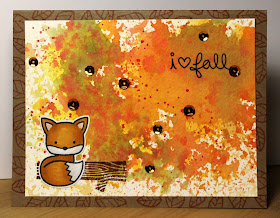
Watercolour Autumn


Hi everyone, thanks so much for stopping by today!

Winter has been dragging on for some time here in Calgary, and while we are all gearing up towards spring and using spring colours, autumn is my favourite season.

I find the colours of fall so beautiful and I wanted to recreate that beauty in this card.

This card is for the Lawnscaping Challenge #122: Watercoloring.


I used various colours of distress ink to "smoosh" a background on 140lb watercolour paper, then stamped the log with Lawn Fawn's Walnut ink and the greeting with Black Licorice. 

I stamped this fox (which was the very first stamp I ever saw from Lawn Fawn and fell in love instantly) with Memento Tuxedo black ink and coloured him with copics. 

The card base is made from craft cardstock and stamped randomly with the open leaves in the same orange ink.


Saturday, 16 January 2016

Birthday Bouquet


Hi everyone, thanks so much for stopping by today.

Today's card is for the Muse Challenge #148. This challenge provides you with a card from one of their wonderful designers, and we (as artist card makers) draw our inspiration from their card.


From the Muse card (shown below), I drew my inspiration from the flowers and the lovely shade of pink that she used. I also loved the scrolling vines coming from the flowers and thought that the scripty greeting in black was a lovely parallel. Of course I had to add some wink of stella to make it shimmer, I just can't resist. I also applied some glossy accents to the centres of the flowers for a bit of additional shine.

It is my hope that one of my cards will inspire you as well.

Anita Bowden created this week's Muse Card

Valentine's Day 2016 Series - Card 7


Hi everyone, thank you so much for stopping by today!

Today's card was so much fun to make. I love the emboss resist technique, especially thick lined stamps, such as the one below. 

This technique will work with stamps that have thinner ridges so long as you use a fine detail embossing powder. A thicker powder may unclean lines. 


Emboss resist technique on 140lb watercolour paper. After the panel dried I cut it in angles with my paper trimmer to create a sunburst effect, and raised alternating beams on foam tape to add dimension.

The heart is watercoloured with pinks, sprinkled with glitter and covered with glossy accents. I used sparkling red thread between the heart and the panel for extra interest and shine.

Friday, 15 January 2016

Delicate Birthday in Purples


Hi everyone, thank you so much for stopping by. I hope you are all having a great day.

Today's card was made by request for my Mother-in-law, who has been a wonderful source of encouragement in my card making journey. Her support and that of my friends and family is something that I can't express enough gratitude for.


For the flower, I took a couple colours of distress markers and coloured directly on the stamp, then I stamped it down, shifted the image and stamped it again. I sponged the background using a very light hand with antique linen. The greeting was gold embossed and die cut then raised up with foam tape. I added 1/4" satin ribbon and 6mm orchid sequins as accents. The matte is a deep purple to complement the other shades within the card.

This card is for the Time Out Challenge #47. I only recently stumbled across this challenge while looking at some of the beautiful cards posted in an MFT challenge. The artists behind these cards are so incredibly talented and I feel so honoured to have my cards featured next to theirs.

Grab Our Badge!

Thank you again for stopping by, I hope you all have a wonderfully crafty day.

All About You Birthday


Hi everyone, thanks so much for stopping by today. 

Today's card is for the MFT Sketch #263 Challenge. This is the first of their challenges that I have participated in, and to be honest, I'm not entirely sure why I haven't played along before.


The challenge group provides you with a sketch to draw inspiration from. This week the sketch is pretty clean and simple.

At first I was terribly intimidated by these sketch challenges, for whatever reason I thought I would have to come up with something completely unique but use the sketch EXACTLY AS SHOWN.

It was only once I realized that the sketch is there to provide guidance and inspiration for me to create something unique.

I can't even tell you how much the designers and guest designers have helped to inspire me and make me feel more comfortable with my particular type of card making.


To create this card, I cut the front panel down to 5 x 3 3/4", I then stamped the flowers and masked them off. I then masked off the top and the bottom portion of the panel. The background was created with distress inks and the flowers are coloured with copics.

Thank you all for stopping by, and I hope you like my take on sketch #263!

Old School Sympathy


Hi everyone, thank you so much for stopping by today.

With all of the gorgeous stamps and colouring mediums out there, it is very easy to let the more basic things fall away to the bottom of your stash.

For me, those things include my embossing folders. I remember a year ago when every card I made included an embossed panel. I just loved the texture and dimension it gave. I'm not sure when it happened, but at some point I stopped using those folders and slowly they made their way from my desk where everything is so easily accessible, to a box on my shelf.

Today, I have three variations of a simple to create sympathy card.


While the design for each of these cards is similar, the use of a different embossing folder gives each a unique look. 

It was incredibly difficult for me to not use stamps or glossy accents or glitter. 

Every now and then, it's good to go through the things that have made their way to the bottom of your stash and get back down to basics. There is a simplistic beauty to the cards we used to create, that's why we made them to begin with, right?

Our styles and techniques will change and evolve over time, keeping up with our interests and the things about the art that excite us, but don't forget to give a little love to your roots. If my first exposure to the world of card making had been all the crazily intricate stamping and colouring and layering I would have been way to intimidated and overwhelmed to even get started. 

Like any process, it all begins with the basics. You have to be able to do simple math before you can move on to advanced algebra, right? The concepts in art are really no different. At least in my opinion. 

I have also found it to be incredibly helpful (not to mention a confidence booster) to return to the basics when a more complicated project has gotten me down. We have all had moments where we just want to throw our hands up in the air and give up because it wasn't coming together the way it looked inside our head. Putting together a simple but elegant card, can help clear your mind and get your creativity back on track.

Just my thoughts on it. I'd love to hear yours.

Valentine's Day 2016 Series - Card 6


Hi everyone! Thank you so much for stopping by, I hope you are all having a great day.

Today's card is not only the next installment in my 2016 Valentine's Day series, it is also my submission for the SSS Challenge: Stencil It, sponsored by Simon Says Stamp.


If you are new to stamping or card making or scrapbooking, I highly recommend checking out Simon Says Stamp

I created this card using a Pure Innocence image from MFT stamps. I stamped her in Antique Linen distress ink on 140lb coldpress watercolour paper, then watercoloured her in. I'm somewhat new to the "no line colouring" technique, but so far I'm very pleased with how my projects have turned out.

The greeting is heat embossed with white powder onto a coral die cut tag, I used the same coral cardstock for the base of the card.

For the background I used a couple shades of distress ink for a fade effect through my stencil. Unfortunately it was an older stencil that I had in my stash, and I don't remember the name of it. Sorry.

Both the inner and outer panels were die cut using Lawn Fawn's stitched rectangle dies. 

Valentine's Day 2016 Series - Card 5


Hello everyone, I hope you are having a great day. Thanks for stopping by.

I created this card using the MFT mime from their Pure Innocence lineup. It wasn't until I had her stamped out and a basic idea for a layout that I realized I had no idea how a mime was really coloured, I knew they wore black and white, but not really how the outfit was put together. TG for google, right?

I coloured the mime with copics and used clear Wink of Stella on her hat and pants to add a bit of shimmer, because why wouldn't they sparkle?

The background panel was created with Lawn Fawn's "A Birdie told me" speech bubble stamp set. Given the sentiment that I chose from the MFT set, I thought the empty speech bubbles were a perfect compliment for the card. The panel was then put on a piece of heart patterned paper. And finished it off with enamel hearts from CTMH.

The sentiment inside says "No Words. Just Love." Sometimes there aren't words to express how you feel, not only is this super cute, it's also quite clever.


Wednesday, 13 January 2016

Masculine Birthday Card in Greens


Hello again! I hope you are all having a great day. I've been working like crazy to get birthday cards and Valentine's day cards stocked up, and it's nice to sit down with my computer. Ahhhh technology...

With Christmas over and Valentine's day right around the corner, it's no wonder we're all thinking spring. Maybe that's just me? I don't know, anyway I've been putting a lot more bright colours into the cards and trying to stay away from the winter themes. I don't like winter at the best of times, so if I have an excuse to look forward to spring, I'll take it.

Today's card is for the Simon Says Stamp Wednesday Challenge, and their theme this week is Ombre. Which was just wonderful for me because I've been using it so much in my backgrounds lately, so I didn't even have to switch creative gears in order to participate this week. Always a win!


All inks are Tim Holtz distress inks on 140lb coldpress watercolour paper.

Update: I just wanted to let you all know that I won the Simon Says Stamp Wednesday Challenge: Ombre with this card!

Thank you all so much for your support and encouragement! It means so much to me.

Second Year Celebration Fusion Challenge


Hi everyone, thanks so much for stopping by today!

Today I have a very special card that was created for the Fusion Challenge! This is for their second year celebration. If you have not checked these guys out, you really should. Just follow the link above, they are amazing.

My submission is very much inspired by the photo


The bouquet is watercoloured using PrismaColor watercolour pencils on 140lb cold press watercolour paper. After stamping the blossoms in archival ink, I masked them off and created a yellow swirl background by pouncing distress ink through the stencil then spritzing with water. Unfortunately, the camera didn't pick up the background nearly as well as I would have liked, but I promise it is there. 


The concept is pretty fantastic. They provide you with an inspiration photo and a sketch, you can either create your design off either or both, so if the picture doesn't really speak to you, the sketch sure will.

Here is the challenge for the celebration. The photo is so beautiful, I think of something between afternoon tea in the garden and an outside wedding when I look at it.


Once again, thank you so much for stopping by. I hope you all like the card!

Saturday, 9 January 2016

Valentine's Day 2016 Series - Card 4


You can't say I didn't give you a heads up. Here he is again. I love this skunk.

I have been a fan of Lawn Fawn for quite some time, and in all that time I have always tried to colour the critters realistically. For this card I stepped away from realism and attempted a more whimsical palette.

To begin, I stamped the flower, then masked it and stamped the skunk on top to create a one layer critter, since he was designed to hold his heart I didn't need to use a mask. I coloured it with copics and used a gem for the centre of the flower. Because of the addition of the flower I wasn't able to use the coordinating die, but fussy cut him out instead.

The hearts were die cut from the same glossy paper I created for my previous card. I mean, why waste an entire sheet of glossy paper when you can just keep cutting and cutting, right?

I duplicated the watercolour background from that card as well. Perhaps it was my eagerness with the water or I didn't scribble as much as I had on the other panel, but the colour was super faint. I used the same colours and scribbled on my acrylic block and then added more colour to the paper. As it happens, I prefer this panel because of the layers that appeared.

The greeting is from two different MFT sets, I couldn't find a sentiment that said exactly what I wanted so I put one together. It took more than a bit of creative masking, but turned out exactly the way I wanted it. Generally I don't shy away from some stamp surgery, but these were so close together I was afraid of cutting the words, and that would have made me very sad indeed.


I'd also like to enter this card into the SSS Challenge "Something New", I had considered creating a baby card, but this little guy is my newest stamp, and the background is also a relatively "new to me" technique, so I thought why not?

Also, don't forget! You can follow me on instagram @trinadezeeuw

Valentine's Day 2016 Series - Card 3


I had used the alcohol ink marbling technique on a snowflake boarder card, and decided I wanted to give it a try in reds for Valentine's Day. Unfortunately, I didn't really have a red, only pink. Needless to say my vision quickly turned to disappointment. However, I thought I'd give it a go anyway and while it wasn't exactly what I had in mind, I found the results satisfactory. 

The background came about by loosely scribbling three shades of distress ink markers to create an ombre effect, then using a flat brush with clean water to blend. I've tried doing this before but had some difficulty making it blend nicely. I found that if I allowed the markers to dry completely before adding the water I ended up with a streakier look that had distinct lines where the marker was applied. In the card, I applied the water as soon as the cap was on the last marker and was incredibly pleased to see the results I was looking for.

The greeting was die cut from the same watercolour paper several times and glued together to add some dimension. I used the mid-tone shade without water to colour the word, then applied glossy accents to make it really pop. 

The "you" was heat embossed with white on the same marble paper the hearts came from then trimmed and applied with foam tape. 


Alcohol ink marbled die cut hearts on watercolour background with dimensional greeting and glossy accents to make it shine.

Valentine's Day 2016 Series - Card 2


Hi everyone, thanks so much for stopping by today!

Before I get into today's card, I just wanted to take a minute and thank you all so very much for all the support. I've been terribly sick the last week so I haven't been posting, but when I logged in today I couldn't believe the increased traffic to my blog over the last few days. Thank you all so much! I can't even begin to tell you how much it means to me.

Today's card features an older stamp set from Lawn Fawn (shocking, right?). This is one of my favourite mini sets that has been released so far, and to be completely honest I really don't use it as much as I should.

I used three shades of distress ink to fill in the tiny hearts stencil for the background, and was lucky enough to find a very close colour match for the panel on the card base.

This is one of those cards where I knew exactly what I wanted to do and it came together super fast. As much as I wish that were the case every time I make a card, I do enjoy the organic process of putting the card together and seeing how it turns out.


Copic Coloured hedgehogs on raised heart focus on tiny hearts distress ink background.

Monday, 4 January 2016

Valentine's Day 2016 Series - Card 1


To officially kick off the 2016 Valentine's Day Card series I have this adorable little card featuring Stinkin' Cute stamp set from Lawn Fawn.

As I mentioned in my previous post, I just adore this little guy; and here he is again!

To create this card, I used a stitched circle die to create the focus that he sits on. I used copic markers to colour the flowers and the skunk, then applied glossy accents to the heart and the middle of each of the flowers.

I had considered stamping the flowers in pink but landed on black to tie in the colouring of the skunk across the card.

I'm not usually a "pink" kind of girl, but this season the colours are really speaking to me. Perhaps I do have a girly side, after all.


Raised focus over argyle stamped background with coordinating flowers and hearts.

Stinkin' Cute Shaker


Okay, so this doesn't really count as a card, but it's so "stinkin' cute" I just couldn't resist.

Oh, right and WELCOME TO VALENTINE'S DAY 2016 SERIES!

I created this with the Ready, Set, Snow die cuts from Lawn Fawn and the Stinkin' Cute skunk. I will warn you now; I love this little guy. I promise you can expect to see him in many future posts. 

I used distress inks to colour the background as well as the shaker frame and I popped up the front on a piece of fun foam that I die cut. I'm going to have to play around with the glue because this did not stick together as well as I would have hoped. Strange that it never happened on any of my other shakers, just this one. 


Copic coloured (adorable) skunk in heart sequin shaker with heat embossed greeting. 

Sunday, 3 January 2016

Late Afternoon Sunshine Hello


While orange is officially my favourite colour, this rusty yellow comes in at a super close second. It reminds me of late afternoon sunshine in the fall (my favourite season, by the way).

As I was organizing my paper stash I found a single sheet of cardstock in this colour. A single sheet of late afternoon sunshine to create a card. If I had the opportunity to recreate this card, I would use more of a gradient in the shading of the flowers.

I used clear Wink of Stella on the butterfly before coating it with glossy accents to really make it shimmer.

There is a a point in the drying of glossy accents where it is still wet and therefore pliable, but not so wet that it will run if the project isn't laid flat. It was at this point that I shaped the wings slightly to make it appear as if the butterfly were in flight. I've tried shaping things once the glossy accents had dried completely, but I only managed to crack the surface. Maybe it's just me, anyone else ever do that?


Copic coloured flowers and butterfly, with glossy accents gold embossed greeting and micro diamond accents.

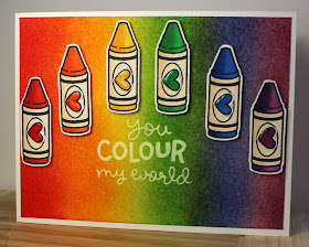
You Colour my World with Distress and Copics


Despite the holiday celebrations and all the Christmas cheer, I rang in the new year feeling a little down. So I needed to make a card that would cheer me up. 

I created this card using rainbow distress inks on watercolour paper. Each of the crayons are coloured with copics that best match the corresponding distress colour. 

I had to get a little creative when it came to stamping the greeting, the stamp (from Lawn Fawn) is American, and here in Canada we spell things a little differently. While it took a bit of time and more than a little bit of masking, I did manage to Canadian up this greeting. (Happy face)

The brightness of this card cheered me up somewhat, I'm not even sure what I'm going to do with it, for now it is sitting on my work table for me to look at when I'm a little blue. 


Distress ink on watercolour paper background, with raised copic coloured crayon focus and white pigment greeting, with glossy accented hearts.