Monday, 31 July 2017

Eat All Cake | ft. Lawn Fawn "Year Three" and "Party Animal"


Hi everyone, thank you for stopping by. I hope you are having a great day.

I have been on this incredible birthday card kick. Usually by now, I have Halloween cards well underway and have completed at least a couple Christmas sketches. But not this year. Looks like this year I'm behind the game - again. I know we always feel like we're behind, when really we're always living a season a head of everyone else.

I'm living in Canada in the longest and hottest heat wave (with weather warnings and everything) and here I am trying to justify not starting my fall and even my holiday cards?! No wonder by the time the day actually rolls around that I'm all holidayed out. Anyway, this year I'm still in full on birthday mode. So the holidays are going to have to wait just a touch longer.


I started by stamping the cake from Lawn Fawn's "Year Three" stamp set, using Memento Tuxedo Black ink on 110lb Copic-friendly cardstock. I wanted to create the look of my own patterned paper, so I stamped the cake randomly, then I filled in the emptier spaces with the little candle image.

I also stamped the bear from the "Party Animal" set on a scrap piece. I coloured all the images in with Copic markers. And I fussy cut the bear out. I had to do a bit of masking before colouring him because I wanted him to be wearing a hat and holding a fork.

I trimmed the cake piece down to about 2 inches wide, then I covered the icing parts with Glossy Accents by Ranger and dunked it into Ranger's Clear Rock Candy glitter. Once that was completely dry I adhered it to the left portion of the card about 1/2" away from the fold. I then used foam tape to pop up my hungry little bear and placed him down.

I used the "Let's Party" greeting from the "Party Animal" set in the same Memento ink.

The sentiment on the inside says "Eat all the cake!" and it didn't even occur to me until editing that I should maybe take a picture of that. Sorry!!

I hope you like today's card and are inspired to create something of your own. If you haven't all ready, please follow me over on the right side bar. If you are viewing this via mobile device, scroll to the bottom and click "View Web Version" first. You can also follow me over on Facebook. Toss me a line in the comments section below and let me know what you think.

This card is for:
Simon Says Stamp Monday Challenge
Sunday, 30 July 2017

Product Review Series | Paper Comparison


Hi everyone, thank you for stopping by. I hope you are having a great day.

Today I will be doing a paper comparison to show how the same images will look vastly different depending on the type of paper you use. I will show the finished card for each paper type. I will also discuss how the paper responded to the pencils and my impression of each.

I'm going to apologize in advance -- this is going to be a long post; hopefully it will help you choose the right paper for your project, and maybe be less afraid to try something new.


For the purposes of today's review, I will be creating three cards using identical methods and products. The only difference between the cards will be the type of paper used. In the top left I have Recollections Kraft 65lb cardstock. In the bottom left I have Staples 110lb cardstock, and finally on the right I have Strathmore Toner Grey 80lb cardstock.

The images come from Lawn Fawn's "Our Friendship Grows" stamp set, stamped with Memento Tuxedo Black ink, using the MISTI. And the greeting comes from Lawn Fawn's "Party Animal" set, also stamped with Memento Tuxedo Black ink.


To colour each of the images, I used Lyra Rembrandt Oil based pencils. The technique I used to colour each image is exactly the same - despite the temptation to add more to certain panels. I'm sure you can immediately see why this temptation arose.


First up I have the Recollections Kraft 80lb Cardstock. I got this from Michaels Craft store. It comes in a pack of 50 for about $5.00. This is the only Kraft cardstock I buy and if you look back through previous posts, this is the one you will see when I use it.

At 65lbs it's a thicker paper. It takes stamping well, but I would certainly not use Copics on it. They bleed out almost instantly. However I love the way the pencils took to this paper. I find that Kraft lends a warmth to the piece as well as a rustic look. As it isn't white, the colours aren't as vibrant as you will see below, but there is a richness to them.


Next up I'm using the Staples 110lb cardstock. I get this from my local Staples for about $20 for a pack of 250. I use this for all my card bases as well as any time I'm colouring with Copic markers. This paper is incredibly sturdy and can handle layering very well.

While the pencils look for vibrant - remember I used the same pencils for all the cards - it felt unfinished, if I were going for a sketchy look this would be great, but I'm not. The surface of this paper is incredibly smooth and the pencils don't grip the paper very well. It was very difficult to not pull in additional colours to bring more life to the flowers.


Finally, I have the Strathmore Toner Grey 80lb cardstock. I got this pad of 36 sheets for about $13 at an art store in my city. First off, this is the thinnest 80lb cardstock I have even seen in my life. I honestly was very disappointed when I opened this package. My first thought was "well, this is never going to work", but as I had committed to a review, I trudged on.

I was terrified of tearing the panel, but the paper ended up being surprisingly tough; it isn't anything I would ever use as a card base, though. Cutting this paper was the same as cutting regular printer paper.

Then I started to apply the colour. Despite being very thin and relatively smooth, the pencils gripped this paper as well as on the Kraft shown above. This paper creates a lovely balance between the two others. Because of the light shade it still allows for the pencils to be vibrant as well as giving some of the warmth that Kraft lends.

When I looked at all three completed panels, the white just stared at me. It was a glaring contrast from the other two. To make it feel more complete I added the twine bow to the right side. I didn't feel that the Kraft or the Toner Grey needed this finishing touch, but I couldn't let that white be left in the cold.

I then matted each of them with a deep yellow cardstock and adhered them to standard A2 sized card bases.

I hope you like today's review. If you haven't all ready, please follow me over on the right sidebar, if you are viewing this via mobile device, scroll to the bottom and click "View Web Version" first. You can also follow me over on Facebook. If you have any questions about any of the papers, or have a suggestion for a future review toss me a line in the comments section below, I would love to hear from you.

Saturday, 29 July 2017

Mermazing Day | ft. MFT's "Mermazing" Stamp Set


Hi everyone, thank you for stopping by. I hope you are having a great day.

Today I wanted to create something that was clean and simple, but still had depth. When I got the Mermazing set I couldn't stop thinking of ideas that I could do with these stamps. Each of the three mermaids seem to have a life of their own. So here she is, maybe showing you out her window to her view or maybe standing (floating?) near a piece of art that she had created. Either way, she looks pretty proud of it. LOL


To begin, I used my two largest nesting oval dies and cut out a few frames from regular cardstock and then one from a shimmering purple cardstock.

I stamped the mermaid from MFT's "Mermazing" set with Memento Tuxedo Black ink on 110lb Copic-friendly cardstock and coloured her in with Copic markers. I went over her tail several times with my clear Wink of Stella glitter brush pen. I really wanted her tail to shine. And while the camera certainly picked it up, let me tell you, this girl sparkles! in real life.

With one of the inner ovals, I stamped the rock and masked it off. I then used Salty Ocean and Tumbled Glass Distress inks to create a watery background. Once that was completely dry, I used the solid scene builder elements from the set to stamp the fishes, kelp and coral.

I did these in the MISTI because I was afraid I would have to restamp them multiple times and I can't line up a stamp to save myself. I don't know why. I have tried and tried and tried, so TG for the MISTI. I used CTMH Whisper ink for the fishes, Olive ink for the Kelp, Sorbet and Goldenrod for the coral.

I then removed the mask and used Copics to colour the rock.

To put the piece together, I placed the oval with the image first, then I built up my frame around it, making sure that each of the four layers had an opportunity to dry before adding the next one. I then adhered the mermaid with Tombow Mono Multi glue where she touches the frame and foam tape where she hangs off.

I then adhered that panel on to a piece of the same shimmering purple cardstock for a frame (just to tie the whole thing together) and then to a standard A2 sized card base. I added some Glossy Accents by Ranger to her starfish hair clip and went over her tail one more time with the clear Wink of Stella. Because I can never have anything too sparkly!

I hope you like today's card and are inspired to create something of your own. If you haven't all ready, please follow my blog over on the right sidebar so you don't miss out on any future posts, if you are viewing this via mobile device, scroll down and tap "View Web Version" first. You can also follow me over on Facebook. Toss me a line in the comments section below and let me know what you think.

This card is for:
Sketch Challenge 343 #mftstamps

Friday, 28 July 2017

Late for Mother's Day | ft. Wplus9 "Beautiful Bouquets: Dahlias"


Hi everyone, thank you for stopping by. I hope you are having a great day.

As I mentioned in a previous post, I was going through a lull when Mother's day and Father's day rolled around, so today I have a card that I had given to my mom for Mother's day way back in May. Seems so long ago, now.


To begin, I stamped the image from Wplus9 using Memento Tuxedo Black ink on 110lb Copic-friendly cardstock. I turned the panel around and then stamped it again. I wasn't concerned about the overlap because it was going to be covered by the cross piece.

I then coloured the image using Copic markers. I wanted something very delicate, so I started at the base of each petal with a very light pink, then pulled it up with an even lighter shade. While it looks like the entire petal is coloured, the ends are actually left completely white, this lends a softness to each petal. I used very light greens for the leaves.

For the cross piece, I stamped the letters using CTMH's "Framework Alphabet" and used the same pinks to create an ombre look. I matted the cross piece with some gold glitter paper and adhered that directly on to the main panel. I had considered popping this up on foam tape, but in the end I decided to just have it flush against the panel.

Finally, I added a scattering of iridescent sequins and adhered the panel to a standard A2 sized card base.

I hope you like today's card and are inspired to create something of your own. If you haven't all ready, please follow me over on the right sidebar. If you are viewing this via mobile device, scroll to the bottom and tap "View Web Version" first. You can also follow me over on Facebook. Toss me a line in the comments section below and let me know what you think.

Thursday, 27 July 2017

Bunch of Thanks | ft. Lawn Fawn "Critters in the Jungle"


Hi everyone, thank you for stopping by. I hope you are having a great day.

If you have been following me for any time at all, you'll know that I love to do a single layer card. For me it is simply magic to pull away the masks and watch a piece come together. That being said, I can do other stuff. I don't typically buy the coordinating dies when it comes to stamp sets, so because I do have the matching die set, I figured I should probably use it.


To begin, I stamped all of the images from Lawn Fawn's "Critters in the Jungle" stamp set using Memento Tuxedo Black ink on 110lb Copic-friendly cardstock. I coloured them all in using Copic markers and die cut them out with the coordinating dies.

For the background panel, I cut down a piece of Strathmore Bristol Smooth cardstock, and dry embossed an oval using my largest oval die. While the die was still in place, I used Shabby Shutters Distress ink to create a light wash of colour over the background. I used a 1/2" corner rounder to round all the edges.

I then used Tombow Mono Multi glue to adhere all my little pieces into place. For the greeting I prepped a piece of black cardstock with my powder tool and stamped the "Thanks a Bunch" sentiment with VersaMark ink and heat embossed it with detail white powder.

I cut fishtail banner ends and adhered it down. I then used the same corner rounder to round out the ends of an A2 sized card base and adhered the panel down.

I hope you like today's card and are inspired to create something of your own. If you haven't all ready, please follow me over on the right side bar so you don't miss any future posts. If you are viewing on a mobile device, scroll to the bottom and tap View Web Version, first. Toss me a line in the comments section below and let me know what you think.

This card is for:

Wednesday, 26 July 2017

Such a Treasure | ft. Lawn Fawn "Ahoy, Matey"


Hi everyone, thank you for stopping by. I hope you are having a great day.

The moment I saw this set, I knew I had to have it. Not only because it's Lawn Fawn but because I love pirates. Love, love, love them! The ideas and sketches just poured out into my inspiration book. I just couldn't even stop.

The hardest part was deciding which one I wanted to do first.


To begin, I drew out rough shore lines on a piece of Strathmore Bristol Smooth cardstock with a regular pencil, then erased them so that I wouldn't see any pencil lines. I then traced the land side with my light brown Zig Clean Color Real Brush marker. I used my small Prisma Waterbrush pen to pull the colour away and let it fade. Once that was dry, I traced the water side with my Light Blue Zig and pulled it away using my water brush. Then I set the panel aside to completely dry.

I stamped the ship, palm trees and mountains from Lawn Fawn's "Ahoy, Matey" stamp set on 110lb Copic-friendly cardstock using Memento Tuxedo Black ink. I also stamped the treasure box, both pirates and the loot. I coloured all the images in with Copic markers and fussy cut them out.

It was at this point I realized I had all ready misplaced the directional stamp from this set so I used one from Stampin' Up's "The Open Sea".

I used my fingers to tear away all the edges of the front panel, and used Antique Linen, Tea Dye and Ground Espresso to make the edges look as though they were burnt.

As I was placing the ship, tree and mountains I decided I wanted just a little something else, so I stamped the shark fin from Lawn Fawn's "Duh-Nuh" set and used that as well. For the map line (treasure line? path?) I made dashes with the chisel tip of my R27 Copic marker. Finally, I added foam tape to the back of the map piece and used my fingers to curl up some of the edges of the map. Then I mounted it on a standard A2 sized card base.


For the inside, I used the other pieces I had coloured and cut out to create a sweet little scene inside the card as well. I arranged the chest with the pirates and adhered them together before placing them inside the card.

For the sentiment I stamped the "You're a Treasure" with Lawn Fawn's Black Licorice ink and used my clear Wink of Stella over the diamond and coins.

I hope you like today's card and are inspired to create something of your own. If you haven't all ready, please follow my blog over on the right sidebar so you don't miss any future posts, if you are viewing this via mobile device just scroll to the bottom and tap "view web version". Toss me a line in the comments section below and let me know what you think.

This card is for:
Simon Says Stamp Wednesday Challenge

Tuesday, 25 July 2017

Mermazing Birthday | ft. MFT's "Mermazing" Stamp Set


Hi everyone, thank you for stopping by. I hope you are having a great day.

I went back and forth on this set for so long. I can't even begin to tell you how many times I put this in my cart then removed it, then put it back then removed it. It was cute, but do I really want it? It's cute, but I don't actually need it.

In the end, it was the solid images that help set the scene, the kelp, coral and fishes, that finally tipped the scales for me. Don't get me wrong, I love the mermaids but I can always, always use scene builders; and this set had pieces that I don't have from anywhere else. So that was that.


To begin, I stamped the mermaid, turtle and a rock in Memento Tuxedo Black ink on 110lb Copic-friendly cardstock. Then I masked the rock and stamped it again and again, until the bottom looked the way I wanted it too.

I masked off all the images, and used Tumbled Glass, Salty Ocean and just a bit of Faded Jeans to create my ocean background. I then used my Distress Sprayer to splatter water over the background. I let that sit for about 20 seconds then patted it dry with a paper towel.

Once the background was completely dry, I stamped the kelp and solid fishes using CTMH Olive, Pear and Whisper inks.

Next I removed all the masks and coloured the images in with Copic markers. I used my clear Wink of Stella glitter brush pen over her tail to make her shimmer. The greeting is a mix of the "You are Mermazing" sentiment and the birthday sentiments from Lawn Fawn's "Lovable Legends", stamped with CTMH Archival ink.

I then mounted this piece on a shimmering purple cardstock for a bit of a border then adhered the entire panel on a standard A2 sized card base.

Finally, I used two of the Pretty Pink Posh 4mm clear droplets and one of the 6mm clear droplets for some interest and dimension.

I hope you like today's card and are inspired to create something of your own. If you haven't all ready, please follow my blog over on the right sidebar so you don't miss out on any future posts. Toss me a line in the comments section below and let me know what you think.

This card is for:
TGIF Challenges


Monday, 24 July 2017

#HappyBirthday | ft. Clearly Besotted "Once Upon a Time"


Hi everyone, thank you for stopping by. I hope you are having a great day.

You ever get inspired and remember that you have that EXACT thing in your stash.... somewhere? Only to then discover that in the course of not using that exact thing for the past couple years, you realize you actually got rid of it. I do that. And invariably, the week after I get rid of something, no matter how long it has been inactive I'll need it.

So I used to have this Polaroid die, and after not using it for a couple years I recently got rid of it. Guess what I need. Guess what I looked for, for hours. Guess what I didn't find, because it went out with a destash a couple weeks ago.

So we improvise. Because at the end of the day, that's what we do.


To begin, I used one of my rectangle dies along with one of my square dies to cut out a basic Polaroid frame. I did have to trim the bottom a bit because it looked a little out of proportion. I then used just the rectangle die to cut a piece of cardstock and a piece of acetate to the same size.

I stamped the Goldilocks and the Three Bears image from Clearly Besotted's "Once Upon a Time" stamp set onto the die cut rectangle with Memento Tuxedo Black ink. I masked them off and used Twisted Citron, Mowed Lawn, Tumbled Glass and Salty Ocean Distress Ink to create a very simple background.

I removed the mask and coloured the image in with Copic markers. The greeting is from Clearly Besotted's "Go Wild" set and the hashtag is from the "Once Upon a Time" set. I just love that I can mix and match the images to go together.

I used 1/8" double sided tape to build my little picture. I then adhered the whole thing down on a craft panel - my idea here was to make it look like it was taped up to a bulletin board. To further that, I double up some washi tape and tore the pieces to look as though it were just a photo taped in place.

Finally, I adhered the entire panel to a standard A2 sized card base.

I hope you like today's card and are inspired to create something of your own. If you haven't all ready, please follow me over on the right sidebar so you don't miss any future posts. Toss me a line in the comments section below and let me know what you think.

This card is for:
Simon Says Stamp Monday Challenge

Sunday, 23 July 2017

Gnome Day, It's a Thing | ft. Lawn Fawn


Hi everyone, thank you for stopping by. I hope you are having a great day.

Have you noticed that every week seems to be national-something-or-other week, and every month is national-support-this-cause month, and it can get really really heavy. Don't get me wrong, there are tons of causes and they all need the exposure, but sadly it gets to a point where I just scroll past it because it's always national-save-the-extinct-animals day.

So, while I was scrolling what national day it was, it turns out that June 21st is Garden Gnome Day. And while I missed the day completely, I couldn't let it pass me by. Every other day gets re-posted through the year so why not one that will at least make people smile?

I crated this card for my sister in law who is one of the most wonderful people I know, not only is she beautiful and kind, she's a hard working mom of two and an amazing wife to my awesome brother in law. So this was for her, to belatedly celebrate a day that celebrates something she loves. Gnomes!


To begin, I stamped the gnome from Lawn Fawn's "Gnome Sweet Gnome" on a scrap of Strathmore Bristol Smooth Cardstock using CTMH's Archival ink. This paper has a vellum finish that makes it awesome for the Zig Clean Color Real Brush Markers, but it does take a little longer for any stamping to dry. So I set that aside.

I then used my two largest stitched square dies to cut a few frames. From one of those pieces I used the very inside to stamp the mushrooms and the flower from Lawn Fawn's "Gleeful Gardens". My idea here was to create a raised frame with a little garden picture inside, but with the gnome on the outside, like it was coming to life; or (if that's too terrifying to think about--because you never know) to have the gnome showing off a picture of his garden.

I coloured all my images in with the Zig Clean Color Real Brush Markers. For the gnome, I started light, pulled the colour out with my waterbrush, let that partially dry, then added more colour to get a watercolour look. For the mushrooms I didn't use any water, I just blended the colours straight from the pen. For the soft blue of the background, I traced around the images, and then pulled the colour out with water to create the halo.

Once everything was dry, I stamped the greeting using the same archival ink. I adhered the stitched square piece down first, where I wanted it to be on the card front. I then used my Tombow Mono glue to build up the frame around it. Finally, I used the same liquid adhesive on the back of gnome where he would be resting on the frame and some foam tape for where he hung off. This creates some support so when it is mailed it won't warp or bend and look sad.

I hope you like today's card and are inspired to create something of your own. If you haven't all ready, please follow me over on the right sidebar so you don't miss any future posts. Toss me a line in the comments section below and let me know what you think.

This card is for:

Saturday, 22 July 2017

Just a Pup | Coloured Pencil on Craft Paper


Hi everyone, thank you for stopping by. I hope you are having a great day.

Today's card is a touch different than what I normally do. Today I've stamped some images from one of my much older sets, way down at the bottom of my stash. But the real treat is the colouring. At least for me. I always forget how much I love the look of coloured pencil on craft paper. No matter how many times you use those pencils, they'll look different on the craft paper.


To begin, I stamped the dog and the dish on craft paper using CTMH Archival ink, I then masked them off and stamped the hydrant and the greeting.

I removed the masks and coloured the images with Prismacolor pencils. For each image there are about three shades, and then I used a white for the highlights.

If colouring on craft is not something you have ever done, I highly recommend it. While we all get a certain sense of satisfaction from colouring, watching the image come to life, there's a different feeling when it comes to the craft. The paper, being darker, lends a warmth to the finished image that I find I don't get when I use pencil crayons on white paper.

I hope you like today's card and are inspired to create something of your own. If you haven't all ready, please follow me over on the right sidebar so you don't miss any future posts. Toss me a line in the comments section below and let me know what you think.

Friday, 21 July 2017

Beeping Birthday | ft. Lawn Fawn "Beep Boop Birthday"


Hi everyone, thank you for stopping by. I hope you are having a great day.

Today I have a super sweet card that can be used for either a boy or a girl's birthday. I was asked to create this card for a friend's nephew, but wasn't given any direction on what he might like. So I had to wing it.


To begin, I stamped the two robots from Lawn Fawn's "Beep Boop Birthday" stamp set, using Memento Tuxedo Black ink on 110lb Copic-friendly Card stock. I then cut the panel down at angles to add some interest to the card.

I then stamped the greeting and balloon string from the same set, I used the solid balloon image with silver Delicata ink.

I coloured the two robots in with the cool grey Copic markers. I like to use the cool greys for metallic images as opposed to the warm greys that I typically reserve for critters and shadows. Before I started with Copics and colouring images I would never have imagined the need for more than one set of grey markers; now, I cannot get enough.

After the balloon was dry, I used my clear Wink of Stella pen to give it some shine and covered it with Glossy Accents by Ranger. Then I set the top piece aside.

For the silver background panel, I prepped it with my powder tool and used the little gear and key pieces from the Beep Boop Birthday set. I wanted some to be darker and some to be lighter and some to barely show up at all. I used CTMH Slate, Whisper and Steel Wool inks for some and VersaMark ink with clear embossing powder for others.

To finish off the card, I raised the white piece up on foam tape to add some dimension then adhered the entire thing to a standard A2 sized card base.

I hope you like today's card and are inspired to create something of your own. If you haven't all ready, please follow me over on the right sidebar so you don't miss any future posts. Toss me a line in the comments section below and let me know what you think.

This card is for:
Fusion Challenge
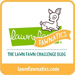
For the challenge, I went with just the sketch for inspiration, I had considered doing some foiling, but turns out I don't have a foil that worked well with this card. Maybe next time.

and

Sketch Challenge 342 #mftstamps

Thursday, 20 July 2017

Birthday Shaker Card | ft. MFT "Magical Unicorns"


Hi everyone, thank you for stopping by. I hope you are having a great day.

Today I have a super fun shaker using MFT stamps, Lawn Fawn dies and a greeting from Clearly Besotted. While I try, and believe me I do try, to keep cards completely within the same brand, sometimes it's hard. I don't have a lot of MFT dies, so any scene I create will either be flat or will have to have something from another company. And while OCD tells me this is important, my creativity says "go wild"!

And really, why shouldn't we? Why limit ourselves, when the thing we are looking for is right there?


To begin, I used my two largest of Lawn Fawn's "Stitched Rectangle" dies to cut a border and inner piece for my shaker. I then took the inner piece and used two of the "Stitched Cloud" border dies to create the fluffy clouds that lay out my scene. With the left over pieces I used the three stitched cloud dies from Lawn Fawn's "Spring Showers" die set.

I then stamped one of the unicorns and the castle from MFT's "Magical Unicorns" stamp set using Memento Tuxedo Black ink on 110lb Copic-friendly cardstock and coloured them in with Copic markers. I used Spun Sugar Distress Ink to add just a touch of shading to the clouds and the background, otherwise it would just look flat. No one likes that.

To set my scene I used one of the cloud pieces on the back part of my panel, laid out the clouds and the castle. Any pieces that were hanging over the edge of the panel, I just trimmed off. This makes the scene look continuous and more natural (as natural as a unicorn running through the clouds can be).

I prepped the front cloud piece with my powder tool and stamped the greetings with VersaMark ink and heat embossed it with gold embossing powder. The "Happy Birthday" is from Clearly Besotted's "Beautiful Friends" set.

Maybe it's just me, but I don't have a lot of greetings that say Happy Birthday, so I find myself going back to the same ones time and again. It would be nice if more of the sets included a birthday greeting, or maybe I just need to be getting my hands on some different sets.

I doubled up my foam tape and used my powder tool along the edges in hopes that my shaker bits wouldn't stick. Not sure it worked this time around, but I assure you it does help.

Finally I mounted the entire piece on a standard A2 sized card base.

I hope you like today's card and are inspired to create something of your own. If you haven't all ready, please follow me over on the right sidebar so you don't miss any future posts. Toss me a line in the comments section below and let me know what you think.

Wednesday, 19 July 2017

Enchanted Birthday | ft. Clearly Besotted "Once Upon A Time"


Hi everyone, thank you for stopping by. I hope you are having a great day.

Today's card was an absolute joy to create. I got to use a few new items, a new stamp set from Clearly Besotted, new Bling from Recollections and a new bottle of Ranger's Multi Medium Matte Adhesive, which isn't really a new thing, but it was a new bottle, and that's kind of the same thing.


To begin, I stamped the princess and the carriage images from Clearly Besotted's "Once Upon A Time" stamp set using Memento Tuxedo Black ink on 110lb Copic-friendly cardstock. I coloured both images in using Copic markers then I masked them off.

I also cut a round mask, because I wanted a moon in the background without the defining lines of a stamped image. I then used Twisted Citron and Mowed Lawn Distress inks for the grassy areas, Gathered Twigs for the road, Faded Jeans, Chipped Sapphire and just a touch of Seedless Preserves for the Sky. I then removed the moon mask, and used Scattered Straw and Mustard Seed for the Moon.

I then removed all the masks and used my clear Wink of Stella glitter brush pen over the carriage and her outfit to make them sparkle. It's a brand new Wink of Stella, so when the light catches it, it looks amazing. I so wish my camera would pick it up better than it does.

To create the stars I mixed some of the White Gold Tansai Gambi watercolour with my Copic Optic White on my acrylic block and splatter it across the sky. I then used the white stars from Recollections' Metallic Iridescent Glitter Shapes with Ranger's Multi Medium Matte adhesive.

The Happy Birthday greeting is from Clearly Besotted's "Beautiful Friends" stamp set; stamped in Delicata Silvery Shimmer ink.

To finish it off, I mounted the panel on a blue sparkly piece of cardstock to give it a coordinating boarder and then adhered the entire piece to a standard A2 sized card base.


This card is for:
Simon Says Stamp Wednesday Challenge:

I hope you like today's card and are inspired to create something of your own. If you haven't all ready, please follow me over on the right sidebar so you don't miss out on any future posts. Toss me a line in the comments section below and let me know what you think.

Tuesday, 18 July 2017

Baby Birthday Bears | ft. Lawn Fawn | Fusion Challenge


Hi everyone, thank you for stopping by. I hope you are having a great day.

Today I have a super cute birthday card (for both a boy and a girl). When I started card making, it was Lawn Fawn that got me going. Not personally, obviously, but it was their designs and sweet sentiments that finally pushed me over. I couldn't resist, and really who could?


To begin, I stamped the bear from Lawn Fawn's "Party Animal" stamp set using Memento Tuxedo Black ink on 110lb Copic-friendly cardstock. I coloured that in with Copics and set that aside. 

I then used the gift stamps to create my own patterned background. 

I matted each white piece with a coordinating blue (and pink for the girl card - seen below). I used foam tape to pop up the bear piece and finished both cards with coordinating enamel dots.


This card is for:
Fusion Challenge
I opted to just use sketch for inspiration

I hope you like today's card and are inspired to create something of your own. If you haven't all ready, please follow me over on the right sidebar so you don't miss any future posts. Toss me a line in the comments section below and let me know what you think.

Monday, 17 July 2017

Not Quite Halloween Shaker | ft. Clearly Besotted "Good to be Bad"


Hi everyone, thank you for stopping by. I hope you are having a great day.

I know it's not quite Halloween, but really, when has that ever stopped me? Sometimes the set that's calling isn't right for the season, but that doesn't mean you can't do it. When I got the "Good to be Bad" set from Clearly Besotted, I couldn't possibly resist!


To begin, I stamped and masked these three ladies, starting with the centre. I then used CTMH Whisper ink to create a smokey background.

I used the smoke clouds from MFT's "Magical Dragons" in the same ink to create a tone on tone pattern.

I then used the second largest of my oval dies to partially cut the oval and fussy cut around the three villains. I used the same oval and the largest oval die to create a black frame to go around the shaker opening.

I removed the masks and coloured the images in with Copic markers.

To create the shaker, I used various confetti and sequins in yellows, oranges and red to make it look like fire. As with any shaker card you have to double up the foam tape to get a really good shake.

As this is the first time using the chunky glitter and small shaker material, I used my powder tool around the edges of the foam tape to make sure that nothing sticks.

I mounted the entire piece on a standard A2 sized card base. Finally I used a glitter pen on the crystal ball and on her broach and covered those with Glossy Accents by Ranger.

I hope you like today's card and are inspired to create something of you own. If you haven't all ready, please follow me over on the right sidebar so you don't miss any future posts. Toss me a line in the comments section below and let me know what you think.

Sunday, 16 July 2017

Glitter Rainbow Unicorn | ft. Zig Clean Color Real Brush Markers


Hi everyone, thank you for stopping by. I hope you are having a great day.

I think the title really says it all. Is there anything more awesome than a glitter rainbow unicorn? I can't think of anything at the moment. This card actually came together as a compromise because I didn't have the stamp I was really looking for. So I settled for the unicorn, which is kind of funny when you think about it because if the low part of my day is "I guess I'll settle for a unicorn" I must be having a pretty good day.


To begin, I stamped the unicorn from Lawn Fawn's "Critters Ever After" stamp set with CTMH Archival ink on 140lb cold-press watercolour paper.

After that was completely dry I used my Zig Clean Color Real Brush Markers to sketch in a grassy area, create a multi-toned sky, colour the unicorn and create the rainbow.

For the rainbow, I began with the red. I drew a freehand arch left some space then used the orange etc. I then went back with my water brush and pulled the colour down, working from top to bottom. I wanted the colours to meet but not to blend too much.

I used my clear Wink of Stella glitter pen to go over the unicorn's hair, hooves and horn. I also used it in streaks over the rainbow. If you are using the Wink of Stella over the Zig Clean Color Real Brush Markers, be careful as it will reactivate the colours. Be sure to clean the brush tip off between colours so you don't muddy up your piece.

I then used a greeting from MFT "Magical Dragon's" with CTMH Archival ink right over top of the rainbow because I like contrast.

Finally I used a whole lot of super sticky two way tape to adhere the panel down to a standard A2 sized card base.

I hope you like today's card and are inspired to create something of your own. If you haven't all ready, please follow me over on the right sidebar so you don't miss any future posts. Toss me a line in the comments section below and let me know what you think.

This card is for:
Lawn Fawnatics Challenge 8:
Lawn Fawnatics Challenge Badge

Saturday, 15 July 2017

Celebrations Slider Card that Interacts in Two Ways


Hi everyone, thank you for stopping by. I hope you are having a great day.

For today's card, I wanted to do something that had not one, but two ways to interact with it. When I started out I knew basically what I was going to do, but having never seen a card like this before, I was a little unsure on how to proceed.

Like any endeavor that seems big or overwhelming at the time, all you have to do is take it one step at a time. And that is exactly what I did.

I'm going to work this post a little differently, and at the end you'll see why. So please bear with me.

Close up of the interactive elements in the finished card. Doors open, portcullis down

I wanted the princess to be behind closed doors, and then have the portcullis as a moving element that you could slide up and down to show the princess behind, inside the castle walls.

To begin, I cut a basic castle outline out of my regular cardstock and used a brick stencil to add the texture. I then cut out a piece for the doors and used a wood grain stamp to make the front and back of the doors look like wood. It is important to do the back, as you will be able to see them when you open the doors.

For the background I die cut some clouds and a sun, and adhered them in place. I used foam tape to create a slider channel behind both the castle and the background sky for the portcullis to slide up and down.

I stamped the princess and did all of the colouring onto a small paper that would fit behind the door. I could have done this directly on the card base, but I didn't want the Copics to bleed through. If that is not something that bothers you, then by all means you can skip this extra step.

The small princess piece is adhered directly to the card base, then I put the panel with slider in place over top. So when you pull the tab at the top, it looks as though you are raising the gate as you can see in the picture above.

Before I show you the finished card, I want to show you what happens when you are careless. I had considered leaving this part out, but then I thought it would be beneficial to see the mistake I made and what I did to fix it.


Before I had figured everything out, I had to put the card aside. Being distracted and careless, at some point I had tossed a baby wipe to the side as well. As you know a baby wipe will destroy anything with Distress Ink. I was so upset. The wipe had sat there for long enough to leech the colour out of a large portion of the card, as well as warp the cardstock and frazzle the edges. I thought I was going to have to toss it.

Finished card with doors closed

Fortunately, I was able to recover the card by adding a banner to the edge. It doesn't seem out of place because of the romantic view we have of castles and princesses, and it was able to cover up my glaring mistake very nicely.

To create this banner, I used my VersaMark Pen and did lines around the borders and then heat embossed it with gold powder. I then used my Distress Inks to make the banner the dark crimson we all associate with the time period; when that was completely dry I used the same gold embossing to add the greeting.

Finished card with doors open, portcullis down
I am hoping that my mistake will encourage you to find a way to salvage your piece instead of throw it out in utter frustration. Believe me, I have been there. I think the reason I was so reluctant to toss this piece, was because when this happened the only thing missing was the princess. I had all ready put so much work into the mechanic and the colouring and design that I would probably have actually started again. 

Finished card with doors open and portcullis up
Thank you for sticking with me through this post, I know it is a long one. I hope you like today's card and are inspired to create something of your own. Don't forget to follow me over on the right sidebar so you don't miss any future posts. Toss me a line in the comments section below and let me know what you think, or let me know about any "whoops" moments you have had and how you fixed them.

Friday, 14 July 2017

Product Review Series - Watercolours | Gansai Tambi Watercolor


Hi everyone, thank you for stopping by. I hope you are having a great day.

For today's review I have the Kuretake Gansai Tambi Watercolors 12 colour palette and Starry Colors 6 colour palette. I was fortunate enough to pick these up at my local art store, and was super excited to try them out for the first time.


Features:

  • Vibrant Colours
  • Individual Pots
  • Water Reactive
  • Blends Easily
  • A little goes a long long way

Both palettes come in cardboard boxes, and though the Starry Colors (seen on the right) have the names written above the colours and on the bottom of the pots, the regular colours do not. There is only a numbering system. After that, it is anyone's guess as to what colour they might be. Sounds silly? Well, sometimes it isn't that obvious.

I opted to purchase the 12 colour palette as it was considerably less expensive than the other ones that were available and I felt it would give me a good indication as to whether or not I would like to use them. To be honest, I'm regretting my choice to be conservative here.


For testing, I stamped out the large sunflower from Lawn Fawn's "Our Friendship Grows" stamp set with CTMH's Archival Black ink on to 140lb cold press watercolour paper.

I found that the best way to "activate" these paints was to spray a bit of water on to the surface of the little tray and let it sit for about 30 seconds. 

I was then able to easily move the colour around either to pick it up directly with my brush or to transfer it to my palette sheet for mixing.


The pigment is so incredibly concentrated in these little pots and only the tiniest amount was able to go a very long way. For the three petals on the right of the flower, I used the bright yellow and a little of the light brown to muddy it up. After mixing I found I was able to fill in all three of these petals without having to "reload" my brush.  The petal at the bottom of the flower was filled in with the "Red Gold" from the Starry Colours. The amount of shimmer here - even the camera was able to pick it up - is incredible. 

The "White Gold" on the far right of the Starry Colors tray is transparent enough that you can use it over top of your project to add shimmer and shine without losing a significant amount of the original colour. So YAY!!

For this mini piece - I prepped the watercolour paper with my powder tool and stamped this floral image from Clearly Besotted's "Friends Forever" stamps set using VersaMark ink and heat embossed it with detail white embossing powder.

I enjoy using heat embossing with watercolours because it creates little walls that keeps the colour pooled together.

For the leaves I used the lighter green with a little bit of brown to move away from the brightness and towards more of a forest or mossy green shade.

I started the flowers conservatively, as I worked my way down the blossoms, I wanted to see how well the colours blended. 

I began by wetting the petal with clean water and dropping the colour in. Blue near the centre and then adding a bit of the red. I noticed as the colours came together it was like watching frost form on a window, they kind of grew together to create this lovely shade of purple.

For the final flower (bottom right) I did the same thing, then added a bit of yellow when the other colours were nearly dry. Please note: I expected to get a muddy brown colour. Because that's typically what happens when you mix yellow with purple. To my surprise and utter delight this did not happen. I allowed the petals to dry completely on their own and did nothing to move the colours around. I simply let the water do its thing.

Final Breakdown:
Pros:
  • Quality vs. Price is quite good - if you are a serious dabbler or really love to use watercolours
  • Individual Pots
  • Excellent reaction to water
  • Dries quickly - both in the pots and on the papers
  • A little goes a long, long way
  • Starry Colors are transparent enough to go over other mediums to add shine
  • Re-activates after it is dry when water is applied
Cons:
  • High Price point - if you are someone who doesn't use or have experience with watercolours, might not be the best place to start
  • So far been unable to find open-stock pots. Unless you're looking online, your art store may not carry these individually. Mine doesn't. 
  • Not very travel friendly - cardboard box + loose pots may equal accidents
  • No colour names for the pots
Given the opportunity, I would definitely purchase a larger palette - not because I don't like mixing, ('cause I sure do!) but because I like all the pretty colours. This 12 colour palette would be an asset in anyone's colouring arsenal, and I expect I'll be reaching for it often.

I hope you enjoyed today's review. If you have any additional information about the Kuretake Gansai Tambi Watercolours or the Starry Colors, I would love to hear it. Please leave a message in the comments section below. If you haven't all ready, please follow me over on the right sidebar so you don't miss any future reviews or project posts.


Thursday, 13 July 2017

Watercolour Wishes| ft. Gansai Tambi Watercolour Paints


Hi everyone, thank you for stopping by. I hope you're having a great day.

It's summer here, and boy is it ever summer. We typically don't get super hot during this time of year, but this year it has been crazy. Today, I thought I would share a card that captured the season both in image and in palette. Also, I wanted to try out some new watercolours that have been sitting on my desk staring at me for the last little bit.


To begin, I prepped a piece of Strathmore 140lb cold press watercolour paper with my powder tool. I then stamped an image from Clearly Besotted's "Fresh Flowers" using VersaMark ink and heat embossed it with white detail embossing powder.

I then used my Gansai Tambi watercolours to colour the image. I have seen dozens of videos using these paints and listened to everyone rave about them; so naturally I just had to try them. I have the 12 colour palette - so incredibly basic. I'll be doing a review of these in the near future.

I then used the White Gold from Gansai Tambi "Starry Colors" to create a shimmer over the petals, sadly the camera doesn't pick that up any more than it picks up the Wink of Stella.

After everything was completely dry I used a piece of natural twine to create a simple bow and glued that in place with some Multi Medium Matte by Ranger - I wanted to make sure this wasn't going anywhere.

The greeting is stamped from Clearly Besotted's "Beautiful Friend" set with Lawn Fawn's Black Licorice ink using the MISTI. I'm terrible at lining up sentiments so the MISTI has become invaluable to me. It is literally worth every single penny.

To finish it off, I covered the back with extra strong adhesive and mounted it on a standard A2 sized card base.

I hope you like today's card and are inspired to create something of your own. If you haven't all ready, don't forget to follow me over on the right sidebar so you don't miss out on any future posts. Toss me a line in the comments section below and let me know what you think.

Wednesday, 12 July 2017

Unbelievable Birthday | ft. Lawn Fawn "Lovable Legends"


Hi everyone, thank you for stopping by. I hope you are having a great day.

I was really on the fence about this stamp set. Did I want it? Well, of course I wanted it. But, did I need it? Not so much. But like most of Lawn Fawn's stuff I just couldn't even resist those faces. Mostly I wanted the Kraken. I all ready have a Yeti from "Yeti, Set, Go" so having a Sasquatch wasn't a priority. The footsteps were a nice little plus, but was it worth buying a full set?

Turns out, yes. Yes it was. At least that's how I'm justifying it. It would be amazing if larger sets could be custom ordered into smaller pieces, so we could just buy the Kraken and the ship, or just the one ewe from "Baaah Humbug", but alas...


To begin, I used Tumbled Glass and Salty Ocean Distress inks for the background splash of colour, I then stamped the dotted ocean waves line from the set in Salty Ocean for a tone on tone look.

I stamped the Kraken and the ship with Memento Tuxedo Black ink on 110lb Copic-friendly cardstock, coloured them in with Copic markers and fussy cut them out. I then added a couple layers of clear Wink of Stella over the Kraken, and finished him off with a coat of Glossy Accents by Ranger.

I popped him up on foam tape and adhered the ship flat on the panel. I stamped the greeting from the same stamp set using Lawn Fawn Black Licorice Ink and traced over the "unbelievable" with a silver glitter pen.

Finally I adhered the panel on a standard A2 sized card base and that was that.

I hope you like today's card and are inspired to create something of your own. If you haven't all ready, don't forget to follow me over on the right sidebar so you don't miss out on any future posts. Toss me a line in the comments section below and let me know what you think.

Tuesday, 11 July 2017

Penny Slider Card | ft. Clearly Besotted's "Hip Hip Hooray" and Lawn Fawn Dies


Hi everyone, thank you for stopping by. I hope you are having a great day.

I gotta say, I think I'm a little bit obsessed with the interactive cards. It literally doubles the possibilities for nearly any card design. Flat, dimensional or interactive there is no end to the possibilities and it is an excellent way to add just a little bit more to a card that lets your recipient know how much you care.

Today's card features Clearly Besotted's "Hip Hip Hooray" stamp set and Lawn Fawn's "Duh-Nuh" as well as their Stitched Cloud borders, Slide on Over dies and Stitched Scallop border dies.

Yeah, there's a lot going on in this one.


I'm going to apologize now, this is a long one. But I promise it will be worth it.

To begin, I used Lawn Fawn's "Stitched Scallop" Border dies with blue vellum and some soft blue cardstock to make layered waves. I then used the "Stitched Cloud" Border dies on white vellum to create two layers of clouds.

I used Distress ink - Pumice Stone and Hickory Smoke - to darken up the clouds, on the waves and paper I used Salty Ocean to create some variance in the waves.

I then took the wave that I wanted behind my scene and my panel and used the waviest of the "Slide on Over" dies to cut my sliding channel.

I stamped the ship from Clearly Besotted's "Hip Hip Hooray" set and the fin from Lawn Fawn's "Duh-Nuh" set with Memento Tuxedo Black ink on 110lb Copic-friendly cardstock. I coloured them with Copic markers and fussy cut them out. I added some clear Wink of Stella to the sail, not because sails are sparkly, but because I have to put glitter somewhere on the paper.

For the sliding, I used the penny method so that when you tip the card it will slide over on it's own and there is no additional pull tab.


The waves and the greeting are stamped with Salty Ocean Distress ink. I put the greeting together using CTMH's "Etched Alphabet" - This is my go-to alphabet, though I do wish it came in lower case as well.

The secret here is double up the foam tape, and check the slide at every step. Not only is it fun, but the sooner you realize there is something that needs to be adjusted the happier you'll be.

I hope you like today's card and are inspired to create something of your own. If you haven't all ready, don't forget to follow me over on the right sidebar. Toss me a line in the comments section below and let me know what you think.

Monday, 10 July 2017

Something for Mom | ft. Clearly Besotted's "Friends Forever"


Hi everyone, thank you for stopping by. I hope you are having a great day.

I thought I would mix things up a bit today and toss in a card that I made a while ago, but never managed to get posted here. You may have noticed I didn't do a whole lot of posting in the first half of the year. I don't know why. I was still making cards, I was still going through Pinterest and Instagram for inspiration, I just didn't have the motivation to actually post anything.

Anyway, to make up for that, you'll probably be getting a mash-up of card themes basically whenever I want to post them! YAY!!


To begin, I stamped the floral image from Clearly Besotted's "Forever Friends" using Memento Tuxedo Black ink on 110lb Copic-friendly card stock. I then masked off the image and sponged in Spun Sugar Distress ink with a light hand to create a halo around the image.

I then removed the mask and coloured the flowers with Copic markers. I mounted that on a pale green piece of cardstock for a border and used the same green for part of the greeting - which was stamped in VersaMark and heat embossed with detail white powder.

The "Happy" is from my die stash and I cut a few from regular cardstock and then one from foiled paper to have a raised, super shiny part to the greeting. Unfortunately the camera didn't pick up the foiling very well, but in real life this was amazing.

Finally I adhered everything to a standard A2 sized card base, and to finish it off I added some drops with irRESISTible Pico embellisher in Wedding White and some clear using Glossy Accents by Ranger.

I hope you like today's card and are inspired to create something of your own. Don't forget to follow me over on the right sidebar, if you haven't all ready, so you don't miss out on any future posts. Toss me a line in the comments section below and let me know what you think.

Sunday, 9 July 2017

Watercolour Dreams | ft. Lawn Fawn's "Dream"


Hi everyone, thank you for stopping by. I hope you are having a great day.

Today's card came about while I was digging through my stash looking for inspiration. Isn't that the way of it? There's always something at the bottom of the stash that you haven't used in a while that just suddenly strikes you.

Going with the "Dream" theme of the stamp set, I wanted a very soft piece that was like the dream itself.


To begin, I prepped a piece of 140lb watercolour paper with my powder tool, and stamped the feather images from Lawn Fawn's "Dream" stamp set using VersaMark ink and heat embossing with detail white powder.

I then created an whimsical pink background using Distress Inks - Spun Sugar, Tattered Rose and Worn Lipstick. For the feathers, I wet the paper first then dropped in colour from Tumbled Glass and Salty Ocean.

I stamped the greeting with CTMH Archival ink using the MISTI. I love the MISTI for stamping on watercolour paper because of the texture. If it doesn't stamp cleanly the first time, just ink it up and stamp again.

To finish it off, I added a few sequins across the piece and adhered them using Aleene's Glass and Bead Adhesive. Once everything was dry I mounted the panel on a standard A2 sized card base.

I hope you like today's card and are inspired to create something of your own. Don't forget to follow me over on the right sidebar so you don't miss out on any future posts. Toss me a line in the comments section below and let me know what you think.

Saturday, 8 July 2017

Micro-Dimensional Scene | Ft. Lawn Fawn "Octopi My Heart" and "Ahoy, Matey"


Hi everyone, thank you for stopping by, I hope you are having a great day.

Today I have a super cute card that features a couple sets from Lawn Fawn (surprise!!!) as well as some masking, distress ink blending, and micro-dimensions.

To clarify, Micro-Dimensions is something I just came up with between sips of coffee this morning. So bear with me if this is all ready a thing and I just don't know about it. Started a new binge on the Netflix last night and I am tired. This is a long post, so hang in there (hahahahaha) but I promise it will be worth it.


To begin, I used two nesting stitched square dies to create a frame and a base layer for my focus point. I ended up cutting 3 frames, and using the largest die to cut 2 squares of blue vellum for the waves.

For the "wave" look, I used the other side of the smallest stitched cloud border dies from Lawn Fawn.

I first stamped the ship from the Ahoy, Matey stamp set, masked it off and then stamped the octopus from the Octopi My Heart set. I had to mask out his face during stamping because he looks all cute and sweet and I wanted him to look grumpy. I then coloured the images using Copic markers and redrew his face in using my black glaze pen.

I masked both the images again and used Distress Ink to create a basic blue for the sea and the Starry night sky in the background. I used the silver Delicata ink for the stars.

Now comes the assembly and the micro dimension. I adhered the tallest and farthest back wave piece to the back of the first frame piece. I then adhered the second or middle wave piece to the front of that same frame. So there is only one piece of paper width between the two waves. I then adhered two frames together and added the foremost wave so it was on the outside of the frames.

Starting from the card base the layers go: Wave piece - frame - wave piece - frame - frame - wave piece. If that makes sense.

I adhered the frames over top of the panel to create the entire framed image. I couldn't believe how much dimension this gave to the image with only a little bit of space between the pieces.

I had considered leaving it like that, but I wanted something clever for the greeting, like "Don't worry, things could be worse" or "Hope your day gets better". In the end I settled on "Hang In There" Which is stamped using CTMH "Etched Alphabet" stamps, heat embossed on a black piece of cardstock.

I hope you like today's card and are inspired to create something of your own. Don't forget to follow me over on the right sidebar so you don't miss out on any future posts. Toss me a line in the comments section below and let me know what you think.

Friday, 7 July 2017

Sunset Meadow Birthday Card | ft. Distress Ink Blending


Hi everyone, thank you for stopping by. I hope you are having a great day.

I've said it before and I'll say it again; masculine cards are hard. And not just a little bit hard -- but like friggin' ridiculously difficult. Maybe it's just me, maybe it's because all the stamp sets I really like are very clearly for kids or for the ladies, I don't know. But having to do a masculine card is something I need to approach when I have zero distractions.

Maybe I'm wrong and guys actually do like the cute little critters and flowers and sparkles. Who knows?

Today I have a card that could work for both masculine and feminine recipients. The process behind this one is very easy, and can be duplicated with nearly any palette you have in mind.


To begin, I prepped a piece of Strathmore Bristol Smooth cardstock with my powder tool. You could also use an old make up brush and some kitchen flour.

I used a solid floral stamp from Inkadinkado "Meadow" stamp set with VersaMark ink along the bottom of the panel. It wasn't quite wide enough, so I reinked and moved the stamp over to get the best coverage along the bottom.

I then heat embossed that with ultra-fine black embossing powder to create what will be the silhouette.

I then cut a round mask for where I wanted my sun to be, and then used Distress Inks to create a sunset sky. I started with Scattered Straw around the sun, then with Dried Marigold, Worn Lipstick, Seedless Preserves, Faded Jeans and then Chipped Sapphire. To get a seamless blend but still retain each colour's definition I recommend working back and forth between the colours with an incredibly light hand.

I then removed the mask and filled in the sun with Antique Linen and faded out with the Scattered Straw.

I popped the greeting up on foam tape to give some dimension and adhered the whole thing on a standard A2 sized card base.

When working with Bristol cardstock a little bit of ink goes a long way, so if this is a cardstock you are unfamiliar with, give yourself some time to practice before starting on your actual piece.

I hope you like today's card and are inspired to create something of your own. Don't forget to follow me over on the right sidebar so you don't miss out on any future posts. Toss me a line in the comments section below and let me know what you think.

Thursday, 6 July 2017

Hippo Birthday | ft. Lawn Fawn "Year Four" Stamp Set


Hi everyone, thank you for stopping by. I hope you are having a great day.

Today's card was created for my sweet niece when she turned 5. She wanted the "Hungry, Hungry Hippo" game, and I thought it would be fun to create a card that coordinated with the gift. I'm sure that was lost on her, but her Mom appreciated it.


To begin, I stamped the images from Lawn Fawn's "Year Four" stamp set, as though they were standing on top of each other, using Memento Tuxedo Black ink on 110lb Copic-friendly cardstock. There was only a little bit of masking for this one using 1" Post-It tape. (The cake is from Lawn Fawn's "Year Three" set)

I cut the panel down to 5 1/2" x 3 1/4", coloured the images in with Copic markers and added foam tape on the back.

For the borders on the card base, I found some super fun polka dot washi tape. The tape I used came from the dollar store, so it wasn't of fantastic quality. That being said, the pattern was also pretty basic so I doubled it up to make the dots appear brighter. (#thriftycrafting)

Once the card was put together, I felt it needed a little something else. Clearly these little guys are waiting on a party so I thought some fun enamel embellishments would be perfect. I typically just use the dots or sequins, but these shapes have been sitting in my stash for ages.

Finally, I added some clear Wink of Stella to the balloon and the icing of the cake, but once again it was lost between the camera and the screen.

I hope you like today's card and are inspired to create something of your own. Don't forget to follow me over on the right sidebar so you don't miss any future posts. Toss me a line in the comments section below and let me know what you think.