Pages

Thursday, 31 August 2017

Berry Great Birthday | ft. Clearly Besotted "Feeling Fruity"


Hi everyone, thank you for stopping by. I hope you are having a great day!

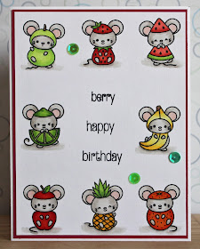
When I got my hands on this stamp set, I couldn't wait to use it. I had to use all the images!

ALL. OF. THEM!!!

Well, except one. I needed a space for the greeting. LOL, my choice for exclusion was based on colour balance, I wanted your eye to roam around the card, and if I had used the blackberry, I thought it would pull the eye too much and leave the card out of balance. I guess I could have coloured him in as a raspberry, but that didn't even occur to me until afterwards. Probably because I like blackberries better.


To begin, I lined up eight of the nine adorable little mice from Clearly Besotted's "Feeling Fruity" in my MISTI - I wanted to make sure they were all straight and I didn't want to risk them not getting a good impression. I stamped them with Memento Tuxedo Black ink on 110lb Copic-friendly cardstock.

I then coloured all of the images with Copic markers. I used some very light warm grey markers to create a soft shadow under each of images. I didn't want them to appear to be floating in the middle of nothing.

I then used my clear Wink of Stella to add a bit of shimmer to all of the fruity parts. The greeting is stamped from Clearly Besotted's "Go Wild" and the word "berry" from "Feeling Fruity", also in Memento ink.

I absolutely love the consistency Clearly Besotted uses for their fonts. Looking at this, no one would ever know that they didn't come from the same set. It adds a whole lot of versatility to the stamp sets when you can pick and choose your sentiment from everything you've got. So a big THANK YOU to Clearly Besotted for that!

I adhered my fruity panel to a piece of red cardstock and then mounted the whole lot on to a standard A2 sized card base.

To finish off the card, I added a few shimmering sequins. If I were to redo this card, I think I would have put the sequins around the greeting in the middle instead of between the little mice.

I hope you like today's card and are inspired to create something of your own. If you haven't already, please follow me over on the right side bar. If you are viewing this via mobile device, please scroll to the bottom and click "View web version" first. You can also follow me over on Facebook. Toss me a line in the comments section below and let me know what you think!

This card is for:
Simon Says Stamp Wednesday Challenge
Wednesday, 30 August 2017

Quick Look at the Brother 2 Scan N Cut in Action


Hi everyone, thank you for stopping by. I hope you are having a great day!

I'm very excited to share with you a quick look at the Brother 2 Scan N Cut in action. Please keep in mind that this is just a super quick video, and I promise another, more in depth video will be post. Also, this is my first time posting a video to Youtube, so please be kind.


You can also see my first impressions post about this machine here.

As I become more comfortable with the video process and evolve my set up, the videos and their quality will improve. But for now, I am really just excited about this first look. 

The image being cut in this video is the little Hula Dancer from MFT's "Polynesian Paradise", cut on my regular 110lb Copic-friendly cardstock. 

This video was filled by my good friend Andrea, who was kind enough to give me permission to use it on my blog.

If you haven't already, please follow me over on the right side bar, you can also follow me over on Facebook. Toss me a line in the comments section below and let me know what you think.

Tuesday, 29 August 2017

One Layer Window | ft. Clearly Besotted's "Miniature Florals Collection"


Hi everyone, thank you for stopping by. I hope you are having a great day.

I love the look of single layer cards, there is an elegance to them, not to mention that in order to achieve the look of dimension it can get crazy technical. Does it count as a one layer card if you add a border? I think so, the actual panel doesn't have any dimension or die cut pieces or anything like that, so it seems to me that it's all one layer. Who's to say?


To begin, I cut down a piece of low-tack masking paper into 1/4" strips. I then masked all the edges of my 110lb Copic-friendly cardstock and created 4 mini windows.

I stamped 3 mini flowers from Clearly Besotted's "Miniature Florals Collection I & II" using Memento Tuxedo Black ink. I absolutely adore the floral stamps from Clearly Besotted.

I then masked off each of the flowers using masks created with 2" Post-It tape. Once all the images and edges were masked off, I used Tumbled Glass, Milled Lavender, Antique Linen and Spun Sugar Distress Inks to create mini ombre backgrounds for each window.

I then removed the masks and coloured the three flower images with Copic markers. The greeting is from Clearly Besotted's "Go Wild" set, also stamped in Memento Tuxedo Black ink, then removed all the masks.

Next, I mounted that panel on a piece of black cardstock to create a thin border and to bring contrast to the white border around the windows. This is where it gets muddy, does it still count as a single layer card? I'm not sure that it technically does. But I'm going to run with it.

I adhered the entire piece to a standard A2 sized card base. And then, of course, I needed a little bit of sparkle. I used my clear Wink of Stella over all of the blossoms in a couple passes to really add some shine.

I hope you like today's card and are inspired to create something of your own. If you haven't already, please follow me over on the right side bar, if you are viewing this via mobile device, scroll to the bottom and click "View web version" first. You can also follow me over on Facebook. Toss me a line in the comments section below and let me know what you think.

Monday, 28 August 2017

Iris Birthday | ft. Prismacolor Premier Pencils


Hi everyone, thank you for stopping by. I hope you're having a great day.

Today I wanted to share a quick card where you can use the same image to create a repeating pattern. I enjoy simple images like this so I can make my own patterns and colour schemes.


To begin, I stamped the iris image (sorry I'm not sure what set this is from, it was at the bottom of the stash) using Memento Tuxedo Black ink on 110lb cardstock.

I then coloured all of the flowers in with Prismacolor Premier pencils. I trimmed the bottom down so that the panel could be raised up.

I used a fun washi tape along the bottom of the card base to add some contrast to the card.

Just a quicky today! But still super fun.

I hope you like today's card and are inspired to create something of your own. If you haven't already, please follow me over on the right side bar, if you are viewing this via mobile device, scroll to the bottom and click "View web version" first. You can also follow me over on Facebook. Toss me a line in the comments section below and let me know what you think.

This card is for:


Featured member for Challenge #231

Sunday, 27 August 2017

Product Review Series | Embossing Ink Comparison


Hi everyone, thank you for stopping by. I hope you are having a great day.

Embossing ink is a clear, sticky ink that is used to hold embossing powder in place, so it can be melted. Embossing ink can also be used without powder to create a tone-on-tone effect. But is there a type that is better than the others?

Today, I'm hoping to provide you with this information. I'm going to compare four different brands of embossing ink and will share my impressions of each. To keep this comparison at a somewhat reasonable length, I will only be comparing their traits for use with embossing powder.

It's going to be a long one, but I hope you find it worth it.


All four of these inks I purchased at different times from my local craft store and they seem to be easy to get a hold of. I'll go through each of them showing the stamping and my observations while using each.

For the purposes of this comparison, all the stamping was done on 65lb black cardstock by Recollections. All panels were prepped using a powder tool to discourage powder from sticking where I don't want it to stick. The stamps used are from Lawn Fawn's "Our Friendship Grows". I have used the small sunflower and the long sentiment.


First up is the Martha Stewart Embossing Stamp Pad
  • Ink pad dries out quickly - my particular purchase came with a reinker and I found that I needed to reink it before use on multiple occasions
  • Lid needs to be taped in place, probably the reason it dries out
  • Stamps well - lines are clear and well defined on cardstock
  • Ink does not hold the powder very well, when sliding off the extra powder much of the powder that was to be stuck to the ink went away as well
  • Results are blotchy and not well defined
  • Relatively inexpensive
  • There is a refill bottle available


Next we have Ranger Perfect Medium
  • Stamps very well - clear crisp lines
  • Ink holds powder very well
  • Generally comes with Perfect Pearls but can be purchased separately 
  • Results are very clear and well defined
  • Moderately priced in my area
  • Refill bottle available online - there wasn't one available in the store

Next is the Stampendous Embossing Ink
  • This comes with a dobber top - so I put it in an empty stamp pad as you can see in the first picture
  • I was unable to find it in an actual stamp pad
  • Using the dobber made the images goopy
  • Results are blotchy - powder does not stick at all despite the extra ink on the page when using either the dobber or the stamp pad
  • Very inexpensive

Finally the VersaMark by Tsukineko
  • Comes in a large pad or a small cube
  • Refills are widely available
  • Stamps cleanly with crisp lines
  • Powder sticks very well
  • Results are very well defined
  • More expensive 

Here are all the finished panels with their respective inks together for easier viewing.

Overall impressions:
  • If you already own the Ranger Perfect Medium because you have purchased the Perfect Pearls, don't feel the need to go out and purchase a separate embossing pad. The Perfect Medium works wonderfully. 
  • From the results of this comparison, I wouldn't recommend either the Martha Stewart or the Stampendous embossing inks. I found them blotchy and inconsistent in their stamping which resulted in poor adhesion of the powder and poorly defined final results.
  • If you are in the store and you don't currently own an embossing ink, I'd recommend whichever is the better deal (the VersaMark or the Perfect Pearls) - just keep in mind that at some point you will need a refill. So find what will be better for you in the long run.
  • In the end, the choice you make will be based on your preferences and on your budget and the availability in your area
  • For myself, I will continue to use the VersaMark ink for my embossing as it is what I have on hand and most widely available in my area

I hope you enjoyed today's review. If you haven't already, please follow me over on the right side bar so you don't miss any future product reviews and projects, if you are viewing this via mobile device, scroll to the bottom and click "View web version" first. You can also follow me over on Facebook. If you have any questions about this review or have a suggestion for a future review please leave me a comment in the section below. I love to hear from you.

*Disclaimer: I am not sent products to review, nor am I paid to review them. I review the products that I find interesting and that I purchase myself with my own money; and I receive no incentive, reward or payment to do so. All reviews are based off of my personal experience using the product and are my opinions only.

Saturday, 26 August 2017

Happy Birthday Dragon | ft. MFT's "Magical Dragons"


Hi everyone, thank you for stopping by. I hope you are having a great day.

Not surprisingly, I was playing around with my MFT "Magical Dragons" set when the idea for this card came about. I wanted the dragon to appear in the cave and the knight to be approaching and then the dragon to be all like "Huh? what's going on?".  I think the expression on this guy's face really just says it all.


To begin, I trimmed down two strips of green cardstock and then used the Lawn Fawn "Grassy Border" die to make my grass. I then cut a large grey circle and a smaller black circle and trimmed their bottoms to create a cave.

I used some Broken China distress ink to add a bit of colour to the background sky.

I stamped the dragon and the knight from MFT's "Magical Dragons" stamp set with Memento Tuxedo Black ink on 110lb Copic-friendly cardstock and used my Brother 2 Scan N Cut machine to cut them out (click here for a first impressions review of the machine). I then coloured them with Copic markers.

I covered the knight with Spectrum Noir Sparkling Clear Overlay to make his armor shine. I love this pen, it sparkles so much in real life and it's even picked up by the camera!

To add some shading to the grass I used some Forest Moss Distress ink to darken it up some and some Hickory Smoke for around the grey of the cave.

I then used some regular tape runner to adhere everything together. I stamped the sentiment directly on the front of my standard A2 sized card base with Memento ink as well.

I hope you like today's card and are inspired to create something of your own. If you haven't already, please follow me over on the right sidebar so you don't miss any future posts, if you are viewing this on a mobile device, scroll to the bottom and click "View web version" first, you can also follow me over on Facebook. Toss me a line in the comments section below and let me know what you think.

This card is for:
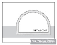
MFT Sketch Challenge
Sketch Challenge 347 #mftstamps
Update: This card was selected as Winner of Sketch Challenge #347!! Can't seem to find a winner badge though

Friday, 25 August 2017

DIY - Make Your Own Stencils Using Border Dies


Hi everyone, thank you for stopping by. I hope you are having a great day.

If you are like me, you have more border dies than you know what to do with. But sometimes we want the illusion of dimension without actually having the additional layers of paper. So what to do? Typically I would cut a border using my regular cardstock and then toss it at the end because it was so saturated with ink that it would either be no good, or the ink would transfer from an old project to a new projects.

Today I will show you how to use your border dies to create your own reusable stencils. 


The materials are pretty basic, and as you can see from the picture above it doesn't take much to make your own great stencils.  I chose to use borders as that is what I stencil most often, but you can do this with any of your dies - for example I plan on creating some balloon stencils so that I can create a party background for a future post (foreshadowing? Yep.)


Start with a piece of clean stencil material. I was able to get a two pack of stencil sheets from my local art store for dirt cheap. It's a thin, plastic material about the same sturdiness as my regular 110lb cardstock. They came in 8 1/2" x 11" and I trimmed it down from there. For the larger stencils in the first picture - I cut them to 6x6" squares and then used the left overs for other dies. 

 
Here I am using two of the "Stitched Hillside" Border dies from Lawn Fawn. These create a great snowy background in any winter scene (or grass if you're going for something a little more summer).

I used some low tack washi tape to hold my border dies in place and then ran them through my die cutting machine. Even though they create a stitched look, it doesn't change the way the stencil works as the stitch doesn't go all the way through the stencil, and if it does the hole isn't large enough to allow ink to pass through; at least for me. It will depend on the type of materials you use.

I did find that I had to run it through my machine twice - I would have done another pass but I didn't want them to shift and ruin my new stencil. After, just remove the tape and the dies, if the cut isn't clean, trace it with your craft blade. This material is incredibly easy to cut so while I did have to use my knife for all the stencils just to get a clean cut, it didn't really feel like I was cutting anything.


To finish it off, I used a smooth surface writer (this one is by Sharpie) to write the name of die that I used to create the stencil.

As you may have noticed from the first picture, they are all Lawn Fawn. The only reason for that is I have all their border dies. I'm not even kidding. It's like a compulsion. Or Pokemon - I just gotta get them all.

For the Ocean Waves and Puffy Clouds, I simply rotated the stencil 90 degrees and used the next size die. 

A couple things to keep in mind:
  • You are cutting a plastic material - watch out for sharp corners
  • If you need to finish off the cut with a craft knife - be careful and take your time, you don't want to slip and cut into your stencil
  • This plastic is not a porous material - like any other stencil the ink will sit on it, it will get on your fingers, it will rub off onto your project - just wipe it clean with a baby wipe
  • Store your stencils flat - these and any other that you may have - I keep mine inside a page protectors with a sheet of black cardstock so I can see it clearly, in a three ring binder
  • Have fun with it! Now that all your dies can also become stencils the possibilities are endless!
I hope today's DIY has been helpful. If you haven't already, please follow me over on the right side bar so you don't miss any future projects or tips, if you are viewing this via mobile device, scroll to the bottom and click "View web version" first. You can also follow me over on Facebook. If you have any questions about this DIY or a suggestion for a future post, please comment in the section below, I would love to hear from you!

Thursday, 24 August 2017

Mostly Monochrome Thanks | ft. Lawn Fawn "Love you a Latte"


Hi everyone, thank you for stopping by. I hope you are having a great day.

Sometimes when the challenges get to be too much (shocking, but it does happen) or I have spent hours working on a product review for an upcoming post, I really like to just play around with my favourite stamp sets. The "Love You a Latte" from Lawn Fawn is by far one of my most loved sets.

I also really like coffee. A lot.

I'm on cup #2. I've been up for just over an hour.

Anyway, today I thought I would share one of those cards that was just a play around and decompress after working on a lengthy DIY (you have to wait until Sunday!)


To begin, I cut down a piece of 110lb Copic-friendly cardstock so that I could use it as a strip across the middle. I then stamped the travel mug from the "Love you a Latte" set with Memento Tuxedo black ink. I wanted it to look like patterned paper.

I then coloured it with Copic markers. I knew this would be on a Kraft background so I wanted the little sleeve to match as closely as I could get it. Once it was coloured in, I felt it was a little bare, so I stamped the coffee bean to fill up some of those white spaces using CTMH Cocoa ink. Then I sent that aside.

I created an A2 sized card base using craft paper, and stamped the large mug in VersaMark ink randomly to get a great tone on tone look. Once again, I used the coffee bean to fill up the space.

Then I adhered the strip to the card base and totally realized I had no greeting. So I cut a piece of vellum using one of my Spellbinder Oval dies and prepped it with my powder tool. I stamped the Thanks from the "Love you a Latte" set with VersaMark ink and embossed with black embossing powder and used tiny little dots of liquid glue to hold that in place.


It then occurred to me that I have these awesome "Lift the Flap" dies, and it would be super fun to give a gift card with this! So I ran the largest of the dies through my die cut machine on a second piece of Kraft cardstock. I then used the little "Life the Flap" saying from the "Push Here" stamp set with the mini arrow, and stamped the mug (same as on the front) using the Lawn Fawn Black Licorice ink with the little steam sentiment "For You".

I coloured the mug in with PrismaColor Premier pencils to add just a splash of colour on the inside since the front is very monochromatic.

To make it so that the flap can be opened and reclosed I used a bit Tombow Mono Multi Glue (green lid) and let it dry. Once this glue dries it becomes repositionable; which is perfect for hiding a gift card!

To get the inside panel to stay inside the card, I used some 1/4" two-way tape to tape around the gift flap opening (wouldn't want to have the flap stuck for real!) and laid it in place.

I hope you like today's card and are inspired to create something of your own. If you haven't already, please follow me over on the right side bar so you don't miss any future posts, if you are viewing this via mobile device, scroll to the bottom and click "View web version" first. You can also follow me over on Facebook. Toss me a line in the comments section below and let me know what you think.

Wednesday, 23 August 2017

Back to School | ft. MFT's "Class Act"


Hi everyone, thank you for stopping by. I hope you are having a great day.

Today I have a card that I made for a dear friend who decided to go back to school. I cannot say how much I admire her for taking this plunge and I wanted something to do something to let her know how proud I am. I know it sounds corny, but it's the truth. I've thought about it for a long time, and never had the courage to reapply - I'm not even sure what I would go back for.


To begin, I stamped the small pencil from MFT's "Class Act" down the left side, using Memento Tuxedo black ink on 110lb Copic-friendly cardstock. I then stamped the girl and the greeting, all from the same set (I love this set).

I coloured all the images in with Copic markers. I used Spectrum Noir Sparkling Clear Sparkling overlay to the silver parts of the pencils, her boots and bag as well as her bows (If you are interested in seeing the difference between the Spectrum Noir and the Wink of Stella, please click here.)

I then adhered the panel to a piece of red cardstock for a fun border and then mounted the entire piece to a standard A2 sized card base.

To finish it off, I used glossy accents over the silver on the pencils and added a few sequins over the right of the girl.

I hope you like today's card and are inspired to create something of your own. If you haven't all ready, please follow me over on the right side bar, if you are viewing this via mobile device, scroll down to the bottom and click "View web version" first. You can also follow me over on Facebook. Toss me a line in the comments section below and let me know what you think.

This card is for: 
Simon says Stamp Wednesday Challenge

Tuesday, 22 August 2017

Wedding Wishes | Stenciling with Shimmer Paste


Hi everyone, thank you for stopping by. I hope you are having a great day.

Today I thought I would share something other than a birthday card. It's been a crazy stretch for birthdays and and cute critters, and I thought I'd mix it up a bit. At the same time, I wanted to share the first look at a new (to me) product that I stumbled across. I'm pretty pleased with the results of this structure paste as this is an incredibly detailed stencil and definitely not the easiest test.


To begin, I cut down a piece of 110lb cardstock and prepped it with my powder tool. I stamped the accent frame and the greeting from Stampin' Up's "Rose Wonder" in VersaMark and heat embossed it using ultra fine silver embossing powder.

I then masked the area off, and secured the panel to my non-stick craft mat, I then placed my Damask stencil over top and secured that in place using some painters tape. I wanted to create a tone on tone look with a bit of texture so I used my Mother of Pearl Simply Acrylic structure paste by Daler-Rowney and spread that evenly over the top. This is a new product for me and once I play with it a bit more I'll have a product review for you.

As with all structure and embossing pastes, it is very important that you clean your tools and stencils as soon as possible. While it will come off after it dries, it is far easier to do this while it is still fresh. I removed the stencil and mask and set the panel aside and cleaned up all the tools. I like to use warm water with some baby soap and a extra soft toothbrush to get into all the little nooks and crannies.

Once the panel was dry, I adhered it to a piece of silver glitter paper for a nice sparkling boarder. I then added a 1.8" satin ribbon to the left and a scattering of iridescent sequins. Finally I adhered the whole piece to a standard A2 sized card base.

I hope you like today's card and are inspired to create something of your own. If you haven't already, please follow me over on the right side bar so you don't miss any future posts. If you are viewing this via mobile device, scroll to the bottom and click "View web version" first, you can also follow me over on Facebook. Toss me a line in the comments section below and let me know what you think.


Monday, 21 August 2017

Hawaiian Hibiscus Birthday | ft Close to my Heart "Hawaiian Hibiscus"


Hi everyone, thank you for stopping by. I hope you are having a great day.

Recently I have been playing around with my Copics and I've been looking for friendly inks that are not Memento. Don't get me wrong, I love my Memento ink and it is still my go-to for stamping images, but it is nice to know that there are options.

As it turns out the water-based dye inks from Close To My Heart seem to be compatible. I haven't tried them all - I do have a lot of them, but the few that I have tried have worked nicely.


To begin, I stamped the smaller hibiscus flower using CTMH's Whisper ink on 110lb Copic-friendly cardstock. I then masked that off and began building up more flowers and leaves around it.

I removed all the masks and coloured the images in with Copic markers. I wanted to keep the lines soft. Despite the size of an actual hibiscus they feel very delicate to me. I didn't want anything harsh or "in your face" about this card.

I stamped the Happy Birthday greeting from Lawn Fawn's "Party Animal" stamp set using the same soft grey ink.

To finish it off I added clear Wink of Stella over the petals (once again it doesn't show up on camera, but I promise it is there). Then I mounted the panel on the front of a standard A2 sized card base.

I hope you like today's card and are inspired to create something of your own. If you haven't all ready, please follow me over on the right side bar so you don't miss any future posts, if you are viewing this via mobile device, scroll to the bottom and click "View web version" first. You can also follow me over on Facebook. Toss me a line in the comments section below and let me know what you think.

This card is for:
Inspired by Kim Heggins
My inspiration lead me straight to Hawaii

Stamping Sensations August Challenge

Sunday, 20 August 2017

Product Review Series | Watercolour Paper Comparison


Hi everyone, thank you for stopping by. I hope you are having a great day.

A few weeks ago, I did a review on the paper types we crafters often use to create our cards or layouts, and a reader requested a watercolour paper comparison. So here it is! Thank you for the suggestion. I am very excited to get started.

Once again, this is a long one. I'd apologize, but I like to be thorough. I also added some fun math at the end!


Today I will be reviewing:

  • Strathmore 140lb Cold pressed watercolour paper - this is my usual paper type.
  • The Artist's Loft 90lb Cold pressed watercolour paper - a less expensive craft store brand.
  • Winsor & Newton 140lb Cold pressed watercolour paper - a more expensive brand.
The test image I used today is the beautiful tulip from Clearly Besotted's "Forever Friends" stamped using the MISTI with Antique Linen Distress ink. I chose this ink to create a "no line" look as I thought the stamped lines would take away from what I'm really trying to showcase today.

All the images are painted using my Gasai Tambi 12 colour palette and my size 4 Prisma water brush pen. All images were allowed to air dry, I did not speed up the process with my heat tool.


Up first is the Strathmore 140lb cold pressed paper.

  • Sturdy paper, doesn't require being taped down for an image like this one, probably a good idea to tape it down if you are doing a whole scene or using lots of water
  • Lots of texture so when I stamped the image it took a couple of impressions using the MISTI to get it done
  • Very little warping when water is applied. 
  • Water seems to pull the colour across the area giving more of a "watercolour" look instead of just being coloured in.
  • Paper flattens almost completely after drying
  • Felt very confidant being able to add additional layers of colour without damaging the paper.
  • Cost vs. Quality is excellent, comes in various sizes and is relatively inexpensive. About $20 CAD for a 15 sheet pad of 11x15"

Next is the Artist's Loft 90lb Cold pressed paper.
  • Paper feels very flimsy and I had immediate concerns about stability
  • Very little texture so it took the initial stamping of the image very well
  • Warping with first pass of water on the paper, even in the small area of the petals
  • Water seems to sit on top of the paper instead of saturating the area so the colour just sat there instead of wicking through the dampened area
  • Paper did NOT dry flat
  • Took much longer to dry
  • Paper took damage after second layer of colour, pilling up and seemed to get mushy after the third.
  • Incredibly inexpensive paper to purchase - less than $8 CAD for a 25 sheet pad of 12x9"


Finally the Winsor & Newton 140lb cold pressed paper.

  • Very sturdy, despite equal poundage it felt thicker than the Strathmore
  •  Nicely textured, took a couple impressions using the MISTI to get a stamped image
  • Water stays where it is put and seemed to absorb straight down
  • Layers, layers, layers - I felt incredibly secure about piling on the layers
  • Almost no warping at all
  • Paper dried almost completely flat
  • Colour wicks across the dampened area beautifully
  • Reasonable amount of drying time per area
  • More expensive "high-end" paper. I paid about $12 CAD for a 15 sheet pad of 4x6"
Painting small images whether from a stamp or freehand is one thing, but we generally don't stop there. At least I don't. After the image area is completely dry, I like to create a halo around the image because I love that dreamy look.

I did that with each of these as well. And each performed about as I would have expected. After seeing how each paper reacted to my initial work, there were no surprises when I went on to add more water over a larger area. For each of these I did tape them to a board (I thought it best to give them all the a real fighting chance.)

Here are the pictures of each piece with the light blue halo. 

Strathmore with Halo

Artist's Loft with Halo

Winsor & Newton with Halo
Overall Impressions:
  • Strathmore: For myself, I will be sticking with this for my watercolour paper. If the opportunity to try something new comes up, I will certainly not turn it away, but for my budget and my art room and the pieces that I typically create this paper is exactly what I need. It is an excellent quality for the cost, it takes layers like a dream, moves the water and paint the way I would expect and want; in the event that I mess up beyond being able to fix it, I'm not devastated if I have to toss it; aside from the amount of work that I just put in.
  • Artist's Loft: This is definitely an instance of you get what you pay for. While I have many other Artist's Loft products and mediums - this paper is not something I would ever buy again. If my daughter decides she wants to watercolour paint, I'll let her use what I have left of this, then upgrade her to something else. My inability to comfortably add layers of colour to this, destroyed any illusions I had that I could find some use for it in my art room. 
  • Winsor & Newton: This paper held up with multiple layers of colour, there was very little warping and zero damage. The colour moves across the page the way I expect it to when I think of watercolouring. That being said, for what I do, this paper behaved too much like the Strathmore for me to justify the difference in price. If you are a serious watercolour artist then this may be more what you are looking for, but then you would probably all ready have your paper of choice picked out.
A little bit of fun math, because why not. Given the prices at the time of this writing (above), I thought it would be fun to work out the cost of each 4x6" piece. 
  • Strathmore: I can get 4 panels at 4x6" out of each sheet, that's 60 panels for each 15 sheet pad; as I mentioned I paid about $20 for it. That works out to about $0.33 per panel
  • Artist's Loft: I can get 3 panels at 4x6" out of each sheet, that's 75 panels for each 25 sheet pad; as I mentioned this pad is about $8. That works out to $0.11 per panel
  • Winsor & Newton: I got exactly 15 panels out of this 4x6" pad and paid about &12 for it. That works out to $0.80 per sheet
I hope you enjoyed this review. If you haven't all ready, please follow me over on the right side bar so you don't miss any future reviews and projects, if you are viewing this via mobile device, scroll to the bottom and click "View web version" first. You can also follow me over on Facebook. If you have any questions about this review or have an idea for a future review, please toss me a line in the comments section below. I would love to hear from you.

*disclaimer: I am not set products to review, nor am I paid to review them. I review the products that I find interesting and that I purchase myself, with my own money; I receive no incentive, payment or reward to do so. All reviews are based off of my personal experiences with them and are my opinion only.

Saturday, 19 August 2017

Birthday Bear | ft. MFT's "Beary Special Birthday"


Hi everyone, thank you for stopping by. I hope you are having a great day.

Today I have a super sweet little bear who's just waiting for the party to start. While I've mentioned before that it was Lawn Fawn that got me going, MFT very quickly rose in the rankings for favourite stamp companies.

Their sweet little images are perfect for nearly any type of card and it is impossible to resist using them! It took a me a little bit to get my hands on this particular stamp set, but I started seeing these impossibly amazing cards and I couldn't hold out any longer.


To begin, I stamped the bear image with Memento Tuxedo Black ink on a piece of 110lb Copic-friendly cardstock. I ran that through my Brother 2 Scan N Cut machine (no more fussy cutting more me!!!) and coloured him in with Copics.

I used the Spectrum Noir Clear Sparkle Overlay on the balloon and covered that with Glossy Accents by Ranger.

While he was drying I stamped the party hat and the pile of gifts on a narrow strip of the same paper. I used Twisted Citron Distress ink to shade the background and then coloured the images in with Copics.

I trimmed down another piece of cardstock and used my half inch corner rounder to soften those edges. I then used Milled Lavender Distress ink to add a bit of colour and then my Gelly Roll black glaze pen to add some stitching detail.

I adhered down the strip, and stamped my greeting. Then I popped the little bear up on some foam tape and placed him down.

Finally I adhered the whole piece to the front of a standard A2 sized card base.

I hope you like today's card and are inspired to create something of your own. If you haven't all ready, please follow me over on the right side bar so you don't miss any future projects. If you are viewing this via mobile device, scroll to the bottom and click "View web version" first. You can also follow me on Facebook. Toss me a line in the comments section below and let me know what you think.

This card is for:
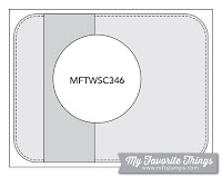
My Favorite Things
Sketch Challenge 346 #mftstamps

Crafty Animals

Friday, 18 August 2017

Brother 2 Scan N Cut | part 1 - First Impressions and Card


Hi everyone, thank you for stopping by. I hope you are having a great day.

Okay, gonna apologize now for a few things. First, I know it isn't technically review day (you'll still get one on Sunday) but I just could not wait. Second, This is going to be a longer post with lots of pictures. Third, The Brother 2 CM350 Scan N Cut is not something I can do all in one review. So as I become more familiar with it I will have more.


I've had this machine less than 24 hours and I legit think I'm in love. I've had other cutting machines but this... this is like nothing else. Based on my less than 24 hours of experience with it I can all ready say that this was the best thing to come into my craft room since my first set of stamps.

So my very first impressions:

  • This is not a cheap purchase. I would highly recommend making sure that this is the right product for you. There is a quilting store in the next town that (as of this writing) sells this for $799 CAD. I did not pay that. I almost died when the lady on the phone told me the price. That being said, it was far less expensive on Amazon (Canada) and I still put it off until they had a deal going on. 
  • It is about the same size as a Cricut cutting machine. It weighs about the same as well, unless you have the first release of the Cricut then maybe this one is lighter, 'cause that thing was huge.
  • It comes with one low tack cutting mat, one blade, a tool for the touch screen (though your finger works) a lifter - you do not want to touch the mat! two pens and one pen holder cartridge which would take the place of the blade in the machine. And more instruction manuals than I have ever seen (They aren't in the picture) All the little tools have a cute little pouch to keep them together.

Here the machine is out of the box, set up and plugged in. Sorry about the lighting, I was way too excited to fiddle around with that. I had to get a picture immediately. The touch screen looks like a hand held gaming device on the top right. It is attached to the machine, don't try to pull it off. Don't ask why I felt that was important to include. It is on a tilter so you can adjust the angle of viewing.


Here is the mat, lifter, touch screen pen and in the bag are the two markers - black and red - and the cartridge they go in.

So for my very first cuts (after test but that's boring and I don't want to bore you. What kind of blogger would I be if I did that?) I decided to use the running unicorn from MFT's "Magical Unicorn" stamp set.

The top one is the original stamp using Memento Tuxedo Black ink on 110lb Copic-friendly cardstock. The lower one is a mirror stamp using the Paper Smooches "Stamp Mirror Blocks". You see what's happening here? 

So sidenote: I'm very new to mirror stamping and there will be a Technique Tip post about it once I practice more. 

The stamp was faint so I went over the lines with a 0.3 Staedtler Pigment Liner. I haven't been able to get Copic Multi-liners and have found that this works.

So basically all you do is stamp your images on the paper, scan it through the machine, crop the area and cut. I chose to add a mini border because it's awesome! And the machine does it all. 

Have I mentioned that this does NOT have to be hooked up to the computer or wifi? That's right this can be used as a stand-alone machine and that is currently my exact intention. It'll be a whole other post if my intentions change.

I coloured the images in with my BG Copic markers and created a spinning card! A glittering unicorn spinning card! YAY!


I used a homemade cloud stencil (spoiler: there will be a DIY post on making that coming soon too!) and Peacock Feathers Distress ink to create a cloudy background.

I sandwiched a length of Unique Ultra Fine Invisible Thread between my unicorns and suspended him in the oval window of my card. I stamped the greeting from the same stamp set in Memento ink and to finish it off I used Spectrum Noir Clear Sparkling Overlay pen on his horn and hooves and covered them with Glossy Accents by Ranger.

I hope you all like this first impressions post on the Brother 2 Scan N Cut machine as well as the first project I used it for. If you haven't all ready, please follow me over on the right sidebar so you don't miss more reviews and projects in the future. If you are viewing this via mobile device, scroll to the bottom and click "View web version" first. You can also follow me over on Facebook.

*disclaimer: I am not paid or given incentive to create product reviews. All reviews and comparisons I do are about products I have actually purchased with my own money, that I find interesting and that I hope others will find helpful. I am not sent products by companies to do reviews nor am I recognized by them for doing so.

Thursday, 17 August 2017

Tropical Birthday | ft. MFT's Polynesian Paradise


Hi everyone, thank you for stopping by. I hope you are having a great day.

Today I have a clean and simple birthday card that I'm hoping will warm the heart of the person I give it to. I know several people who loooove the tropics and I thought that this card would be loved just as much.

I've really been trying to challenge myself to use some of the smaller stamps in a set instead of running for the big one each time. Don't get me wrong, it was hard not to reach for the little dancer in this set.

Believe me, I sat for a bit trying to figure out how she could fit in here, but in the end I was able to control myself. Just barely.


To begin, I stamped the toucan from MFT's "Polynesian Paradise" stamp set using Memento Tuxedo Black ink on 110lb Copic-friendly card stock. I then coloured it with Copics and fussy cut him out.

Next I used some Dried Marigold Distress ink to sponge a circular area on my standard A2 sized card base. I then used some orange cardstock to create two banner accent pieces. I wanted a bit more black to tie the card together so I used my Gelly Roll black glaze pen to add some stitch detail to the larger banner.

I stamped the Happy Birthday greeting using Memento Tuxedo black ink. Once I had the banners adhered in place, I popped the little toucan up on some foam tape to give the card a bit of dimension.

To finish it off I added a few enamel dots for interest and because you know I gotta have my bling.

I hope you like today's card and are inspired to create something of your own. If you haven't all ready, please follow me over on the right side bar so you don't miss any future posts; if you are viewing this via mobile device, scroll to the bottom and click "View web version" first. You can also follow me over on Facebook. Toss me a line in the comments section below and let me know what you think.

This card is for:
2 Crafty Critter Crazies

Fusion Card Challenge

Wednesday, 16 August 2017

Freehand Thanks | ft. Zig Clean Color Real Brush Markers


Hi everyone, thank you for stopping by, I hope you are having a great day.

Recently, my Mom went on vacation to visit some family on the island. She had a fantastic time and wanted to express her gratitude. My Aunt has always been a huge supporter of my work and any art that I put together. So when Mom asked me to create a thank you card for her, I wanted something that I knew they would both love.


To begin, I roughly sketched in the horizon and the scene using a regular pencil. I then used my Zig Clean Color Real Brush markers to add the islands then my Prisma waterbrush to pull out the colour. Once that was dry, I added the water and again pulled out the colour; always being careful not to trap the pencil under the colour. Once it's trapped it's not coming out.

I erased any pencil marks and added darker shades of each colour to give it some depth. Finally I sketched in the palm trees, right over top of the scene that was all ready there. The great thing about these markers is the ability to layer colours.

Once everything was dry, I used my light and medium grays to add some shadows. I then stamped the sentiment using CTMH's Archival Black ink.

To put the card together, I adhered the watercoloured piece to black cardstock to give it a border and then put the whole thing on a standard A2 sized card base.

I hope you like today's card and are inspired to create something of your own. If you haven't all ready, please follow me over on the right side bar so you don't miss any future posts; if you are viewing this via mobile device, scroll to the bottom and click "View web version" first. You can also follow me over on Facebook. Toss me a line in the comments section below and let me know what you think.

This card is for:
Simon Says Stamp Wednesday Challenge
Tuesday, 15 August 2017

Watercolour Dahlias | ft. Wplus9 and Zig Clean Color Real Brush Markers


Hi everyone, thank you for stopping by. I hope you are having a great day.

I created this card for my Mom's birthday, this is one of my absolute favourite floral images. While I'm sure there is a traditional way to colour dahlias, I typically let my imagination take flight and colour with what calls to me.

This is also my first time joining the Flower Challenge as well as the Cards Galore Encore Challenge. Check out their links below and I hope you'll play along!


To begin, I prepped a piece of Strathmore 140lb coldpress watercolour paper with my powder tool and used VersaMark ink to stamp the beautiful Dahlia image from Wplus9 "Beautiful Bouquets" and heat embossed it with white detail embossing powder.

I then used my Zig Clean Color Real Brush Markers to add a tiny bit of colour where I wanted the petal or the leaf to be the darkest and used my Prisma waterbrush to pull the colour out. After all the petals and leaves where done, I traced around the lower right side of each area with my light grey and pulled that out to create a shadow.

The greeting from CTMH's "Sending Smiles" is heat embossed with detail silver powder.

I used some super sticky two way tape to adhere the watercolour paper to a piece of coordinating patterned paper and then put the entire piece on a standard A2 sized card base.

I hope you like today's card and are inspired to create something of your own. If you haven't all ready, please follow me over on the right side bar. If you are viewing this via mobile device, scroll to the bottom and click "View web version" first. You can also follow me over on Facebook. Toss me a line in the comments section below and let me know what you think.

This card is for:
We would love you to display our banner !


Don't Forget Your Badge! 
Selected as Design Team Favourite by Denyse and Carole For the August 2017 Challenge #44
Thank you so much, ladies!!!

Monday, 14 August 2017

So Much Cake Shaker | ft. MFT's "Beary Special Birthday"


Hi everyone, thank you for stopping by. I hope you are having a great day.

It happens every time. Every birthday; that delicious cake is just staring at you and you want to just gobble the whole thing up. We've all been there. Normally we don't actually do that. It wouldn't be proper.

Someone forgot to tell that to this little guy.


To begin, I stamped this sweet little bear from MFT's "Beary Special Birthday" with Memento Tuxedo Black ink on 110lb Copic-friendly cardstock.

I then used my largest oval die to do some partial die cutting, I fussy cut the space around him. I then coloured him with Copic markers, I used some Glossy Accents by Ranger over the icing of the cake and then dipped it in the Clear Rock Candy Glitter.

I lined up the top panel with the bottom to determine where I wanted the balloons. They are also from the same set, stamped with Memento ink and coloured with Copics. I used a very light shade to colour background behind the balloons and the same shade to make some diagonal lines on the front panel.

I added a piece of acetate behind the window and created my shaker area with doubled up foam tape. I filled the space with sequins and chunky glitter and stuck them together. I thought it needed a little something more so I created so stitch lines with a thin multi-liner.

Finally I adhered the entire thing to a standard A2 sized card base. For the banner I die cut a piece of cardstock using the mini banner die from Lawn Fawn's "Magic Color Slider" die set.

I hope you like today's card and are inspired to create something of your own. If you haven't all ready, please follow me over on the right side bar; if you are viewing this via mobile device, scroll to the bottom and click "View web version" first. You can also follow me over on Facebook. Toss me a line in the comments section below and let me know what you think.

This card is for:
Inspired by Tracey McNeely

Crafting from the Heart
Crafting from the Heart Badge

2 Crafty Critter Crazies